Brand Identity & Strategy
Brand identity is where strategy and design meet. These projects go beyond just making things look good. They're about understanding who a client is, what they stand for, and translating that into a visual system that works consistently across every touchpoint. Each project below started with a conversation and ended with a cohesive identity built to last.
Featured Projects
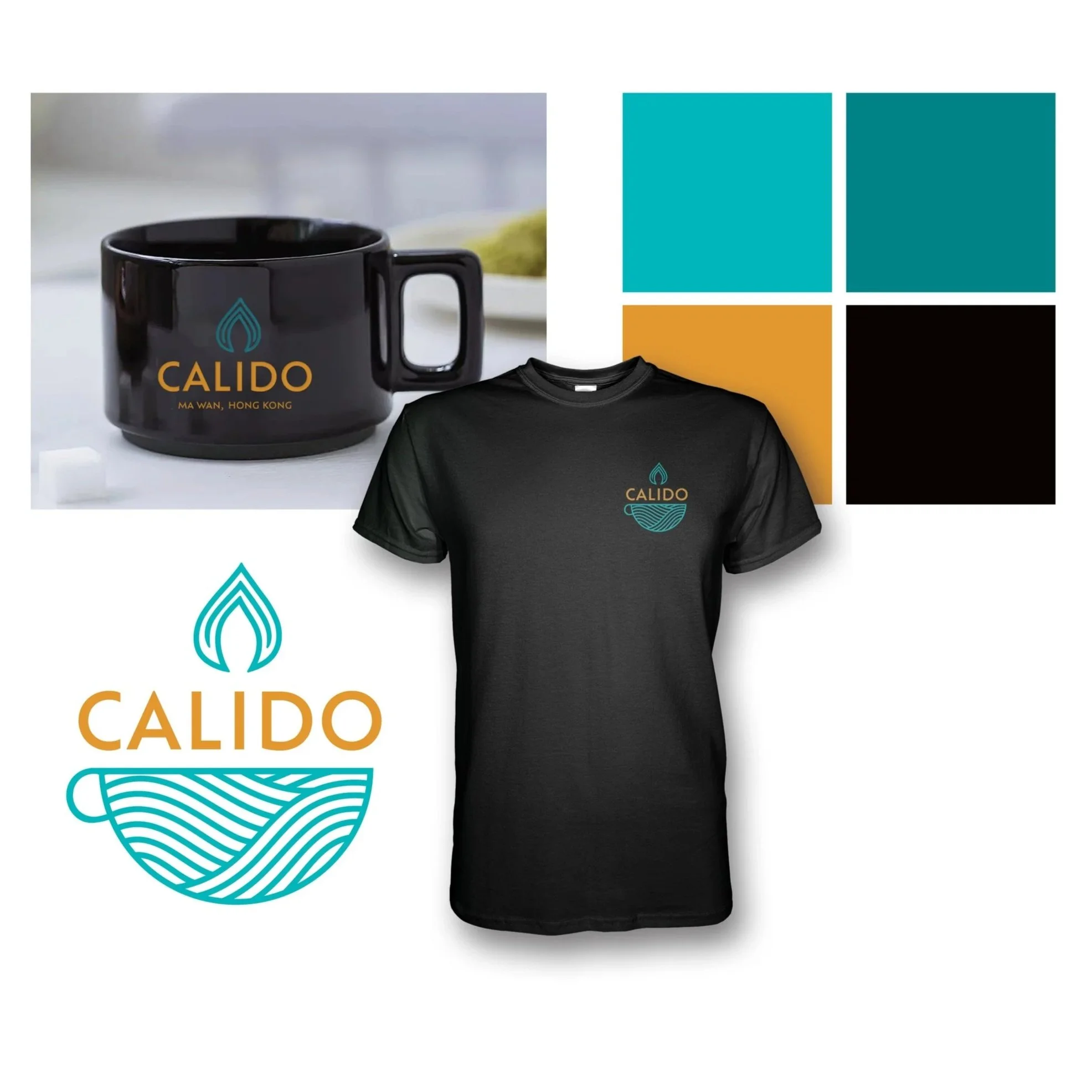
Calido Bar & Restaurant — Logo Design
Calido is a Sri Lankan-inspired bar and restaurant based in Hong Kong, and the logo needed to bridge two culinary worlds in one mark. It centers on a flame-and-cup icon, where the flame represents the warmth and spice of Sri Lankan cuisine, and the cup's wave-like patterns nod to both the ocean at Calido Beach and the comfort of shared meals and drinks. A bold sans-serif wordmark ties it together, balancing approachability with the sophistication needed for an urban Hong Kong audience. The color palette of teal, golden yellow, and black grounds the design in the brand's tropical roots while keeping it feeling modern and cosmopolitan. The result is a logo built to work across signage, menus, apparel, and digital platforms without losing any of its character.
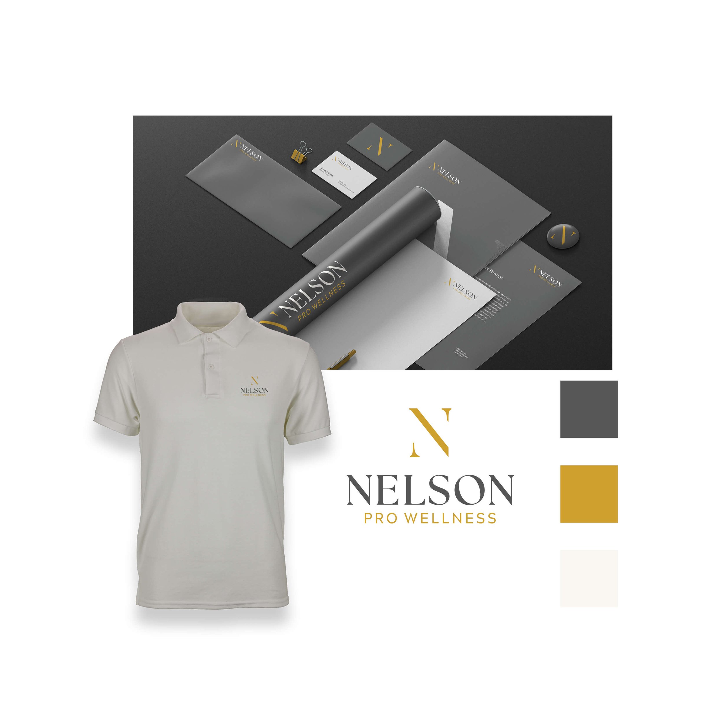
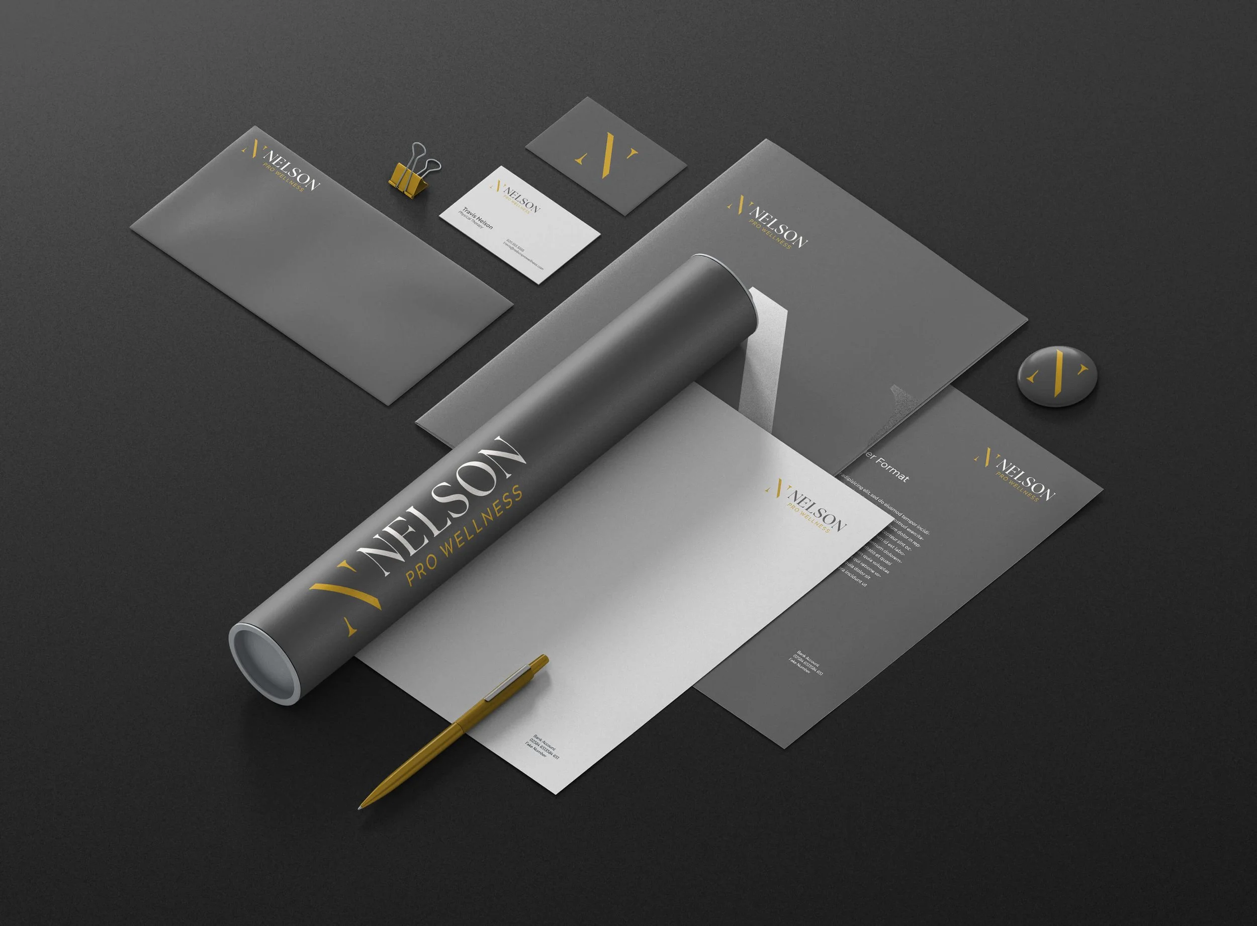
Nelson Pro Wellness — Brand Identity
A personal training and wellness coach needed a brand that felt premium and trustworthy without leaning on tired fitness clichés. The Monogram Authority, leads with a bold gold "N" monogram crest paired with a classic serif wordmark, projecting prestige and immediate recognizability. The refined typography pairs a full-weight serif for "NELSON" in sophisticated charcoal gray with a clean modern sans-serif for "PRO WELLNESS" in accent gold, balancing tradition with a forward-thinking sensibility. The color system of ironstone gray, golden vitality, and ivory balance reinforces the brand's positioning as professional, results-driven, and approachable. The monogram functions independently as a watermark, social icon, or certification seal, making it highly versatile across apparel, merchandise, and digital platforms. Clean, timeless, and built for a clientele that expects excellence in every detail.
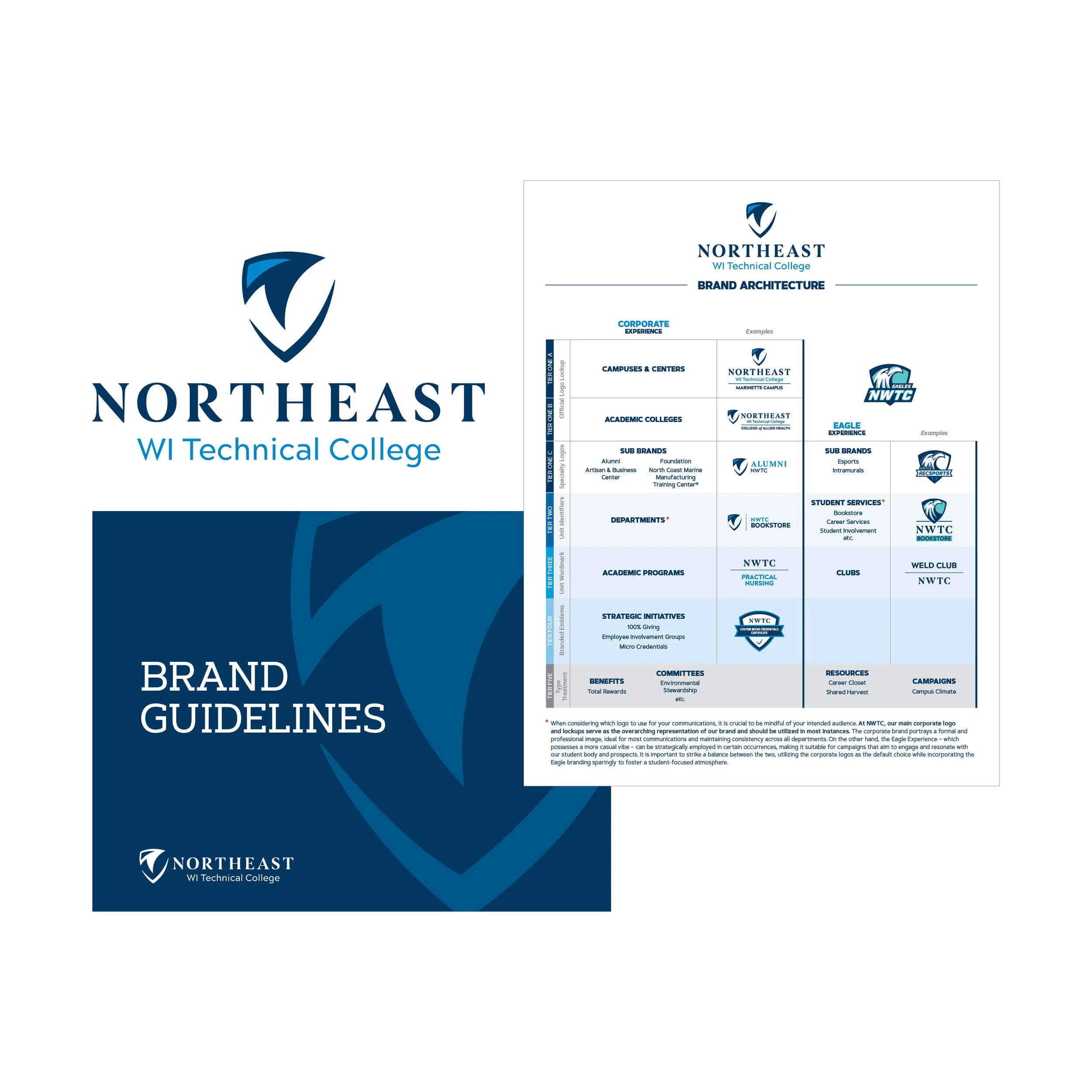
NWTC — Brand Identity and Guidelines
Northeast Wisconsin Technical College needed more than a brand guide. They needed a complete identity system built from the ground up. I led the design of the primary logo and all logo lockups, developed the brand architecture, a tiered hierarchy system that defines which departments, campuses, and units earn a logo, a lockup, a unit identifier, or a type treatment, bringing much-needed clarity and consistency to how the college presents itself across dozens of entities. Beyond the visual work, I also drove the brand strategy and co-wrote the copy that gives the guide its voice. The final document covers everything from logo usage and color palette to typography, photography standards, and marketing applications, giving hundreds of staff and faculty across multiple campuses the tools to tell the NWTC story with confidence. This was one of the most expansive and rewarding brand projects of my career.