Campaigns
Campaign work is where everything comes together. One concept has to stretch across a dozen different formats, from a social media graphic someone scrolls past in two seconds to a billboard they see on their commute every day, and it all has to feel cohesive. This section shows how I approach that challenge, handling everything from digital ads and print collateral to outdoor signage and campaign overviews that document the full scope of the work from brief to final execution.
Featured Projects
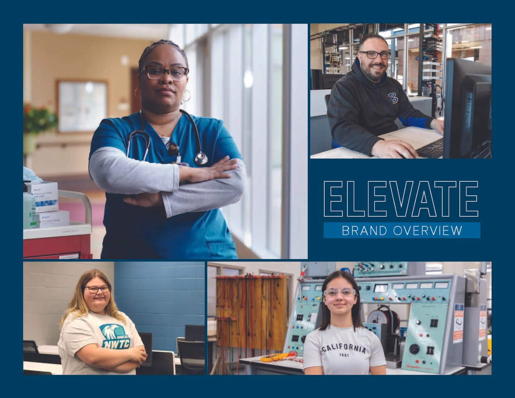
NWTC — Elevate Campaign
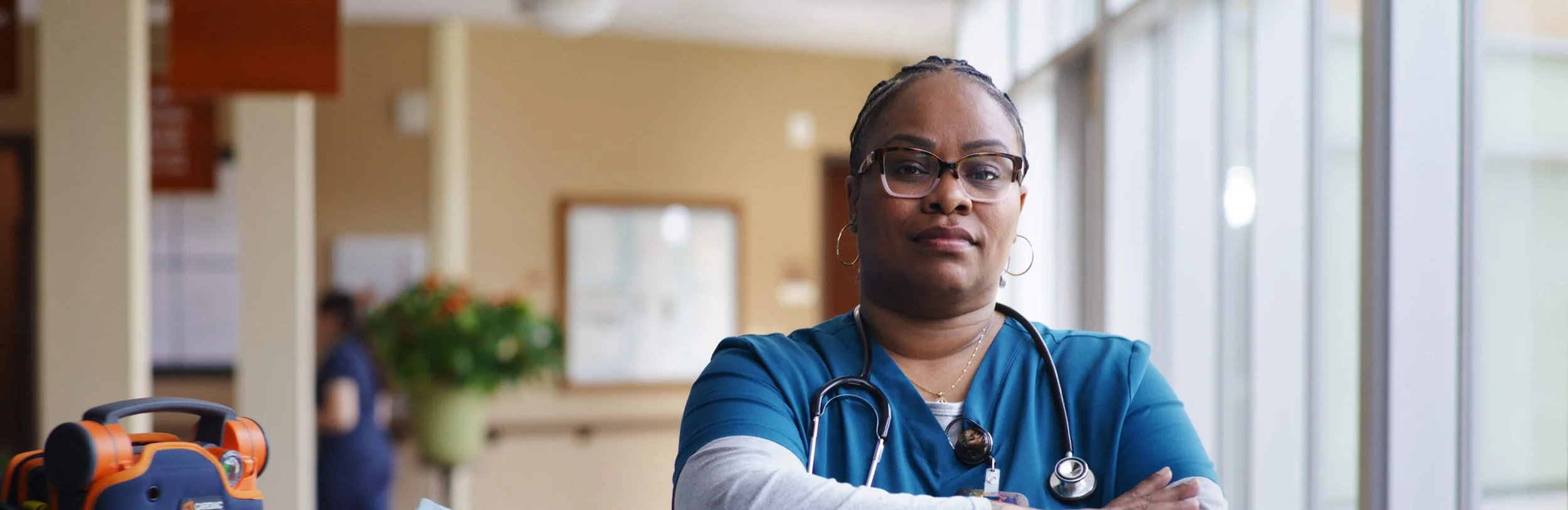
Technical education has an image problem, and the Elevate campaign was built to change that. The core idea was simple but powerful: NWTC doesn't just educate, it elevates. Students, industries, and communities alike. Launched in June 2025 and running through 2027, this is a fully integrated multimedia campaign built around real student and alumni stories, told with unfiltered, confident photography that puts people front and center.
The creative concept centers on a flexible tagline system, "Here to Elevate [WORD]," where the final word shifts to reflect each individual's story. Here to Elevate My Purpose. Here to Elevate My Curiosity. Here to Elevate My Calling. It's a framework that scales beautifully across every touchpoint while keeping each execution feeling personal and specific.
The campaign spans an impressive range of media including paid social across Facebook, Instagram, and Snapchat, paid search, connected TV and YouTube video, radio, newspaper ads, direct mail postcards, billboards, digital signage, perimeter signage, window decals, pull-up banners, branded giveaway items, PowerPoint and letterhead templates, and a dedicated landing page. The brand overview document, which I designed and wrote, ties it all together into a single cohesive presentation that communicates the strategy, creative direction, tactics, and deliverables to internal stakeholders.
This is the kind of campaign that goes beyond design. It's a movement with a message, and getting to be the designer behind it has been one of the highlights of my career.
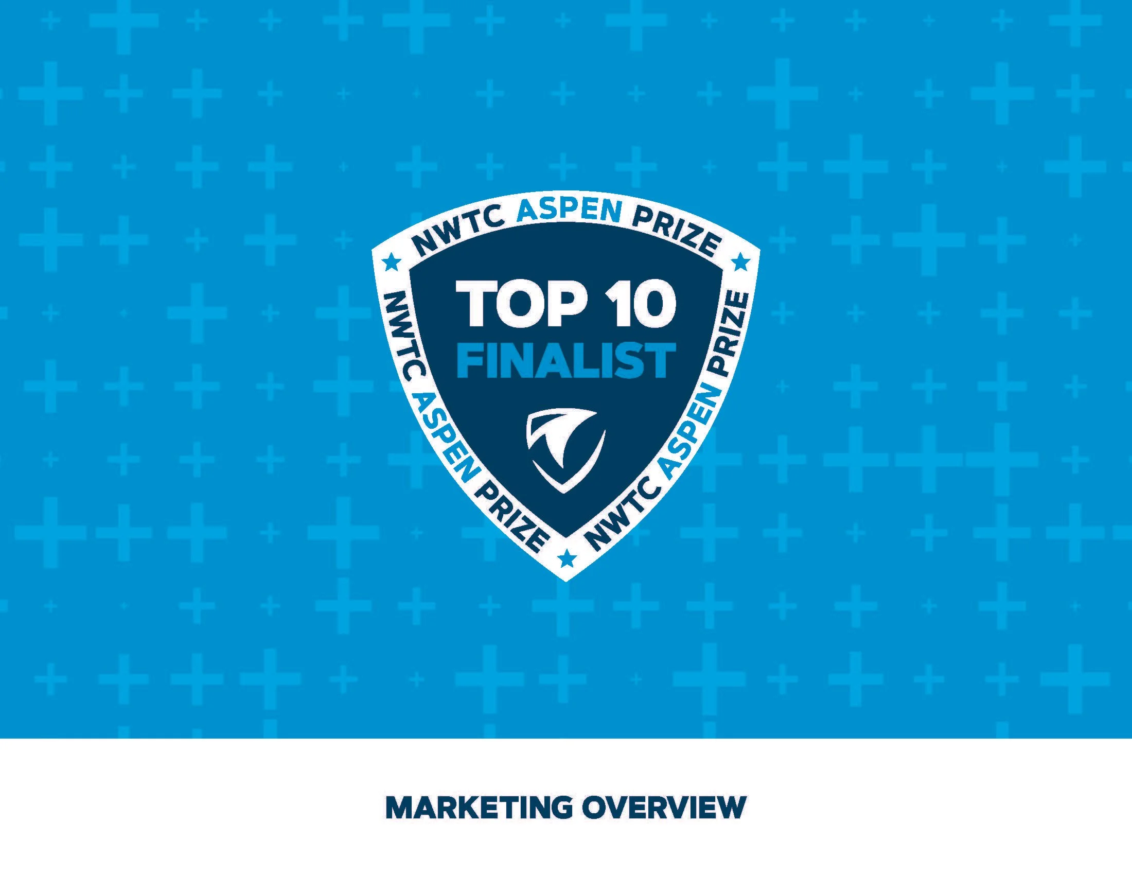
NWTC — Aspen Prize Top 10 Finalist Campaign
Being named a Top 10 Finalist for the Aspen Prize for Community College Excellence, often described as the Oscars for great community colleges, is a once-in-a-career moment for an institution. When NWTC earned that recognition, the design had to match the magnitude of the achievement. This campaign is one of the most expansive and creatively rewarding projects I've worked on, touching virtually every medium and format imaginable.
It started with a custom badge and visual identity built around the Top 10 Finalist designation, anchored by the NWTC shield and a bold, celebratory color palette of bright cyan and deep navy. From there the campaign expanded into an impressive array of touchpoints including a dedicated landing page, outdoor digital signage, TV monitor graphics, email signature banners, Microsoft Teams backgrounds, computer wallpapers, pull-up banners in two sizes, window decals installed throughout campus, business cards, a sticker sheet, and branded t-shirts.
But what really made this campaign special was how far it went to build community pride. For the Summer-Pa-Looza celebration event, I designed a full suite of assets including Snapchat filters, social story graphics, a polaroid selfie photo frame, an easel sign encouraging attendees to walk the carpet and strike a pose, a branded handout with QR codes, and even a custom award trophy prop. I also curated and designed the cover art for a branded Spotify playlist tied to the campaign. Every piece, from the largest outdoor sign to the smallest sticker, was designed to make students, staff, and the greater community feel genuinely proud to be part of something extraordinary.
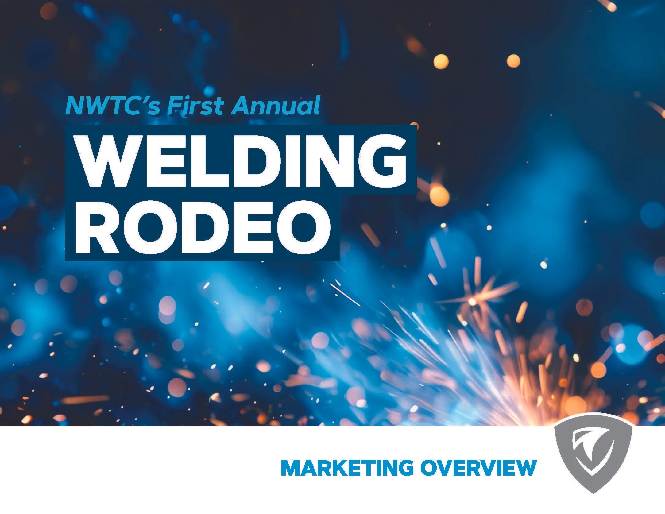
NWTC — Annual Welding Rodeo Campaign
There's something genuinely exciting about building a brand from scratch for an event that has never existed before. NWTC's First Annual Welding Rodeo was exactly that, a brand new competition bringing together amateur, professional, and corporate welding teams across two campuses to build sculptures from donated scrap metal, with finished pieces auctioned off to support student scholarships. The event needed a visual identity that felt as bold and energetic as the craft itself, and the design delivered exactly that.
The Welding Rodeo brand was built around dramatic welding photography, deep navy and electric blue tones, and a strong typographic identity that felt competitive and exciting without losing the NWTC brand thread. The logo treatment incorporated subtle lightning bolt elements to reinforce the energy and spark of the welding process, and the shield icon kept it rooted in the NWTC family of marks.
From there the campaign stretched across an impressive range of touchpoints for both the Sturgeon Bay and Marinette campus locations. This included a custom landing page and campus-specific event pages, paid social media ads across Facebook, Instagram, and Snapchat in multiple formats, TV monitor graphics, PowerPoint presentation templates, save the date postcards, auction flyers, newspaper ads sized and adapted for five different regional publications including the Peninsula Pulse, Marinette Eagle Herald, Menominee County Journal, Peshtigo Times, and Green Bay Press Times, and large format 10 by 4 foot banners for both campuses. Every piece carried the same visual energy while being thoughtfully adapted for its specific format and audience.
This campaign is a great example of what it looks like to take a brand new event, build it a complete identity, and then deploy that identity consistently across every touchpoint from a social media story to a banner hung outside a building.