Logo Design
Logo design is where I get to do some of my deepest thinking. Every mark in this section went through rounds of research, strategy, and refinement before it ever became a final file. What you see here is the tip of the iceberg.
Featured Projects
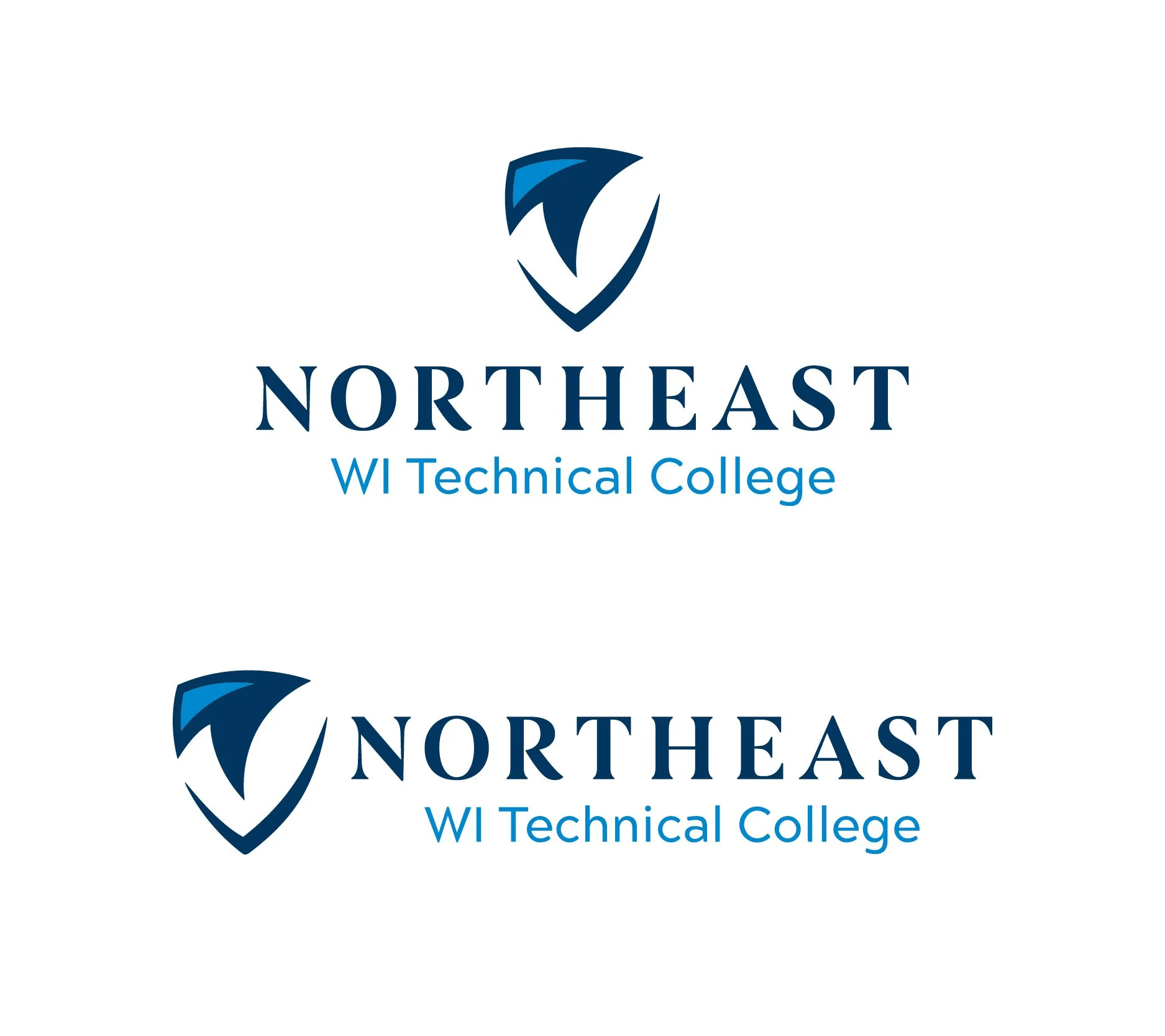
Northeast Wisconsin Technical College
Sometimes the best design challenges are the ones that land on your desk with a tight deadline and minimal direction. I was given one week to design a new logo for Northeast Wisconsin Technical College with little more than a starting point: make it eagle-inspired, and make it work alongside the mascot logo. The mascot, an eagle within a shield, became both a reference point and a constraint. The new logo needed to feel like a natural companion without competing for attention or simply repeating what the mascot had already established.
The solution was a curvilinear shield icon that echoes the spirit of the mascot while standing completely on its own as an institutional mark. Where the mascot is bold and spirited, the primary logo is clean, confident, and forward-moving. The upward angle of the shield suggests progress and momentum, while the paired typography, a modern sans-serif alongside a strong serif, reinforces the icon's precision and gives visual weight to the word "Northeast," grounding the college firmly in its regional identity. The result is a logo built to represent an entire institution across every surface, from business cards and letterhead to building signage and merchandise, and one that has stood the test of time.
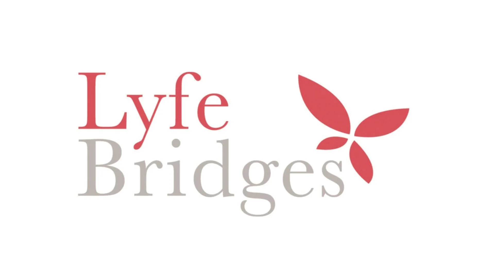
Lyfe Bridges
Lyfe Bridges existed to help young adults find their footing and step into a more independent future, and the logo needed to carry that mission in every curve and color. The centerpiece is an abstract butterfly, a symbol rich with meaning: transformation, resilience, and the beauty of becoming. For an organization built around new beginnings, there was no more fitting image. The butterfly is rendered in warm rose tones, soft enough to feel welcoming and safe rather than corporate or clinical. It's paired with a friendly serif wordmark where "Lyfe" is set in a deeper rose and "Bridges" in a warm taupe, creating a gentle visual hierarchy that feels conversational and human. The overall palette and typography were chosen deliberately to evoke warmth and tranquility, reflecting the supportive, community-centered nature of the organization and the people it serves.
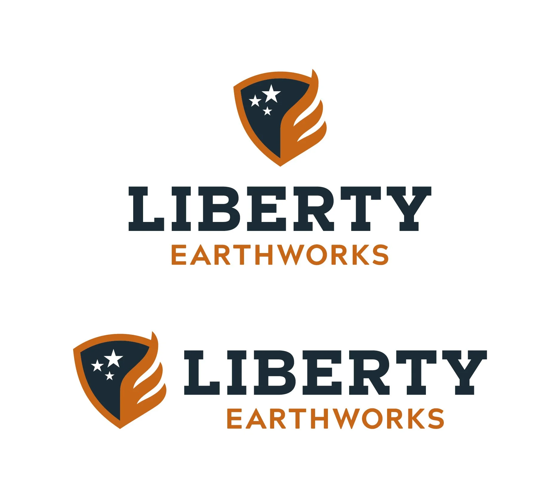
Liberty Earthworks
Liberty Earthworks is a hauling and construction company, and the logo needed to feel as solid and trustworthy as the work they do. The shield at the center is more than a symbol of strength though. Look closer and it becomes an American flag. The wing and torch element doubles as the flag's stripes, while also forming the shape of an "E" for Earthworks, and the three stars represent something deeply personal: the owner's three daughters. That kind of layered meaning is what separates a good logo from a great one. The navy and burnt orange color palette is bold and masculine, perfectly suited for the industry, while the strong condensed typography reinforces a sense of confidence and reliability. Every element earns its place, and the result is a mark that feels both patriotic and personal.
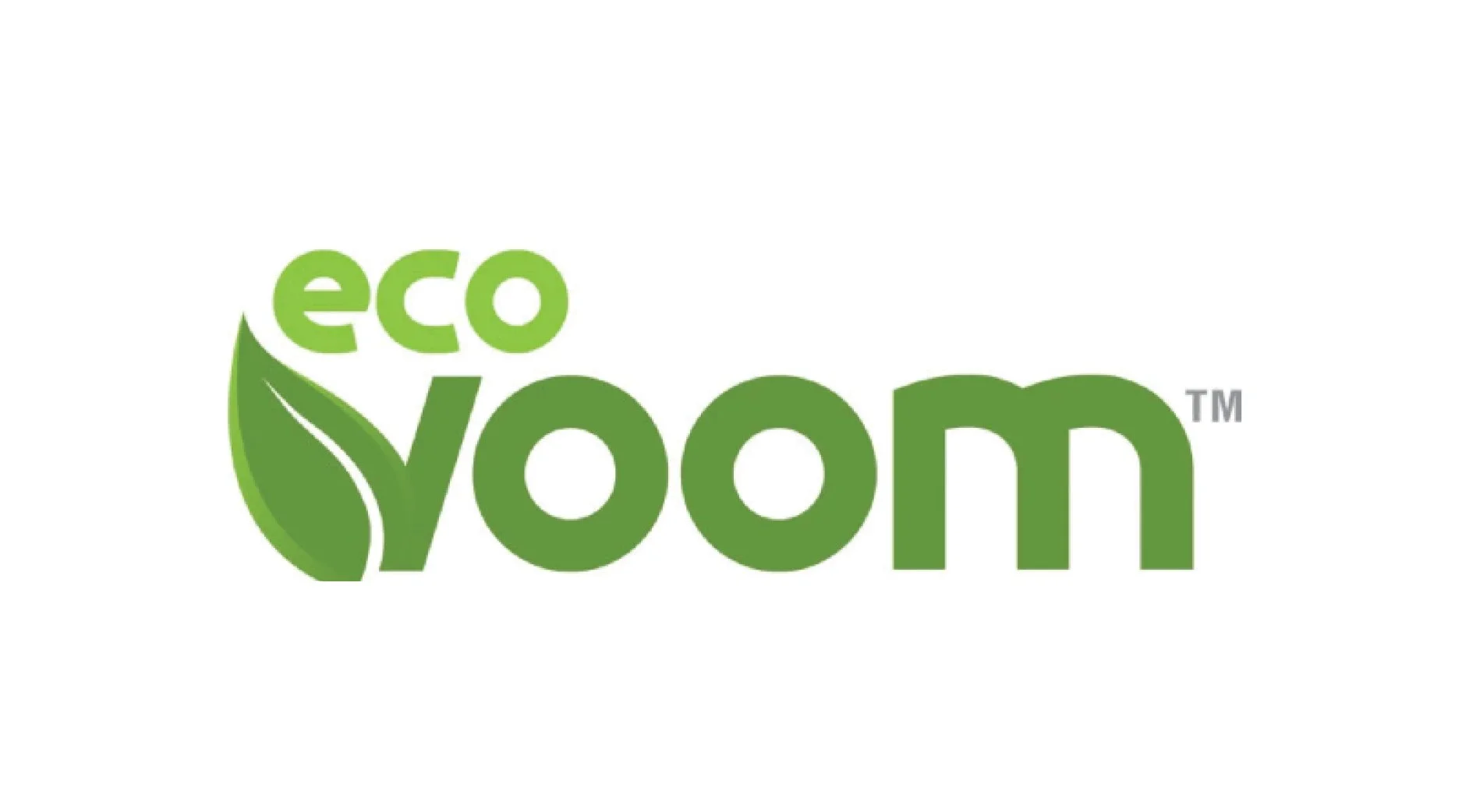
EcoVoom is an eco-friendly cleaning product company based in Costa Rica, and the logo needed to communicate clean, green, and trustworthy at a glance. The approach is refreshingly simple: a bold, rounded sans-serif wordmark in two shades of green, with a natural leaf emerging organically from the letterforms themselves. The leaf doesn't feel like an afterthought or a decorative add-on. It grows directly out of the type, making nature feel like a core ingredient of the brand rather than a badge slapped on for credibility. The dual green palette, a bright lime for "eco" and a deeper, earthier green for "voom," creates a subtle but effective hierarchy while also suggesting the contrast between fresh, natural ingredients and powerful cleaning results. The rounded letterforms keep the mark feeling approachable and friendly, which is important for a consumer product brand, while the bold weight gives it enough presence to hold its own on packaging, signage, and digital platforms. It's the kind of logo that tells you exactly what a company is about before you've read a single word.