Print & Editorial
Good print design is about more than making something look nice on paper. It's about guiding the reader, organizing information with intention, and knowing how every design decision affects the final product. These projects reflect years of work across editorial layouts, publications, and marketing collateral, with a deep respect for typography, grid, and craft.
Featured Projects
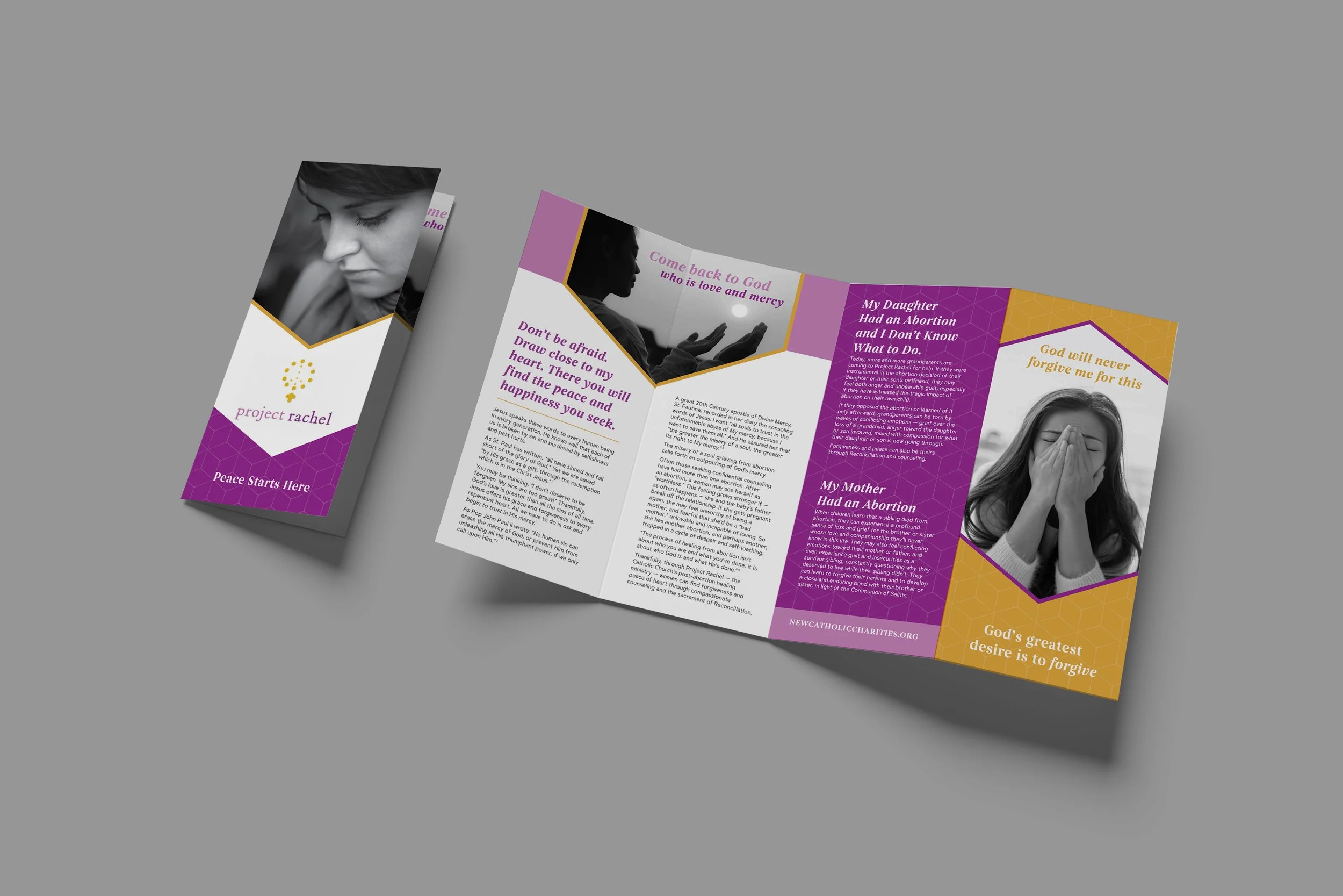
Catholic Charities — Project Rachel Brochure
Project Rachel is a healing ministry for those affected by abortion, and this piece needed to handle a sensitive subject with care, compassion, and dignity. I designed a 4-panel brochure aimed at parents, using the Project Rachel existing purple and gold brand colors alongside black and white photography to create a tone that felt both grounded and gentle. The layout was intentional in its pacing, guiding the reader through difficult content in a way that felt supportive rather than overwhelming. This project was a good reminder that sometimes the most important design work is the kind that requires as much empathy as it does craft.
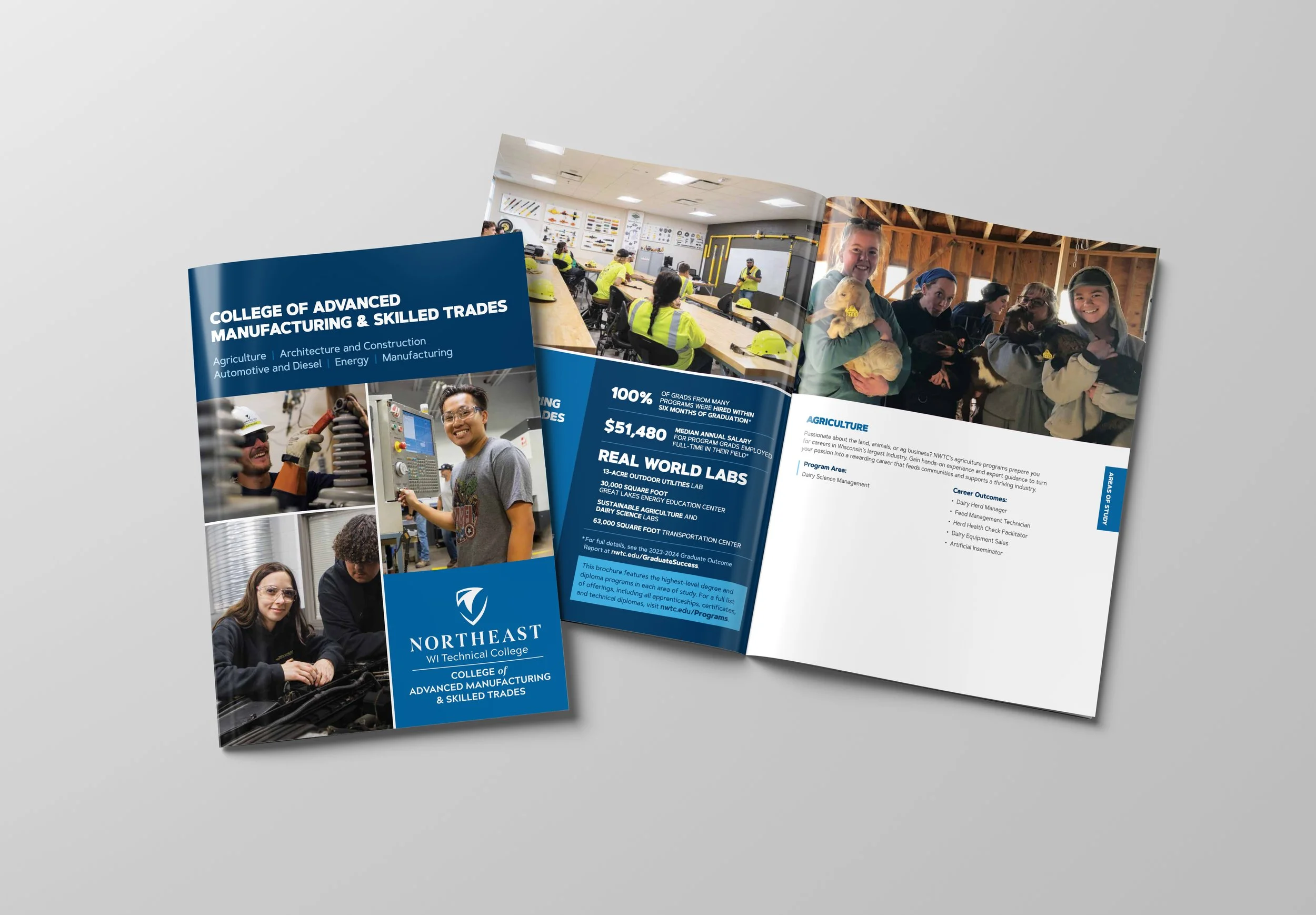
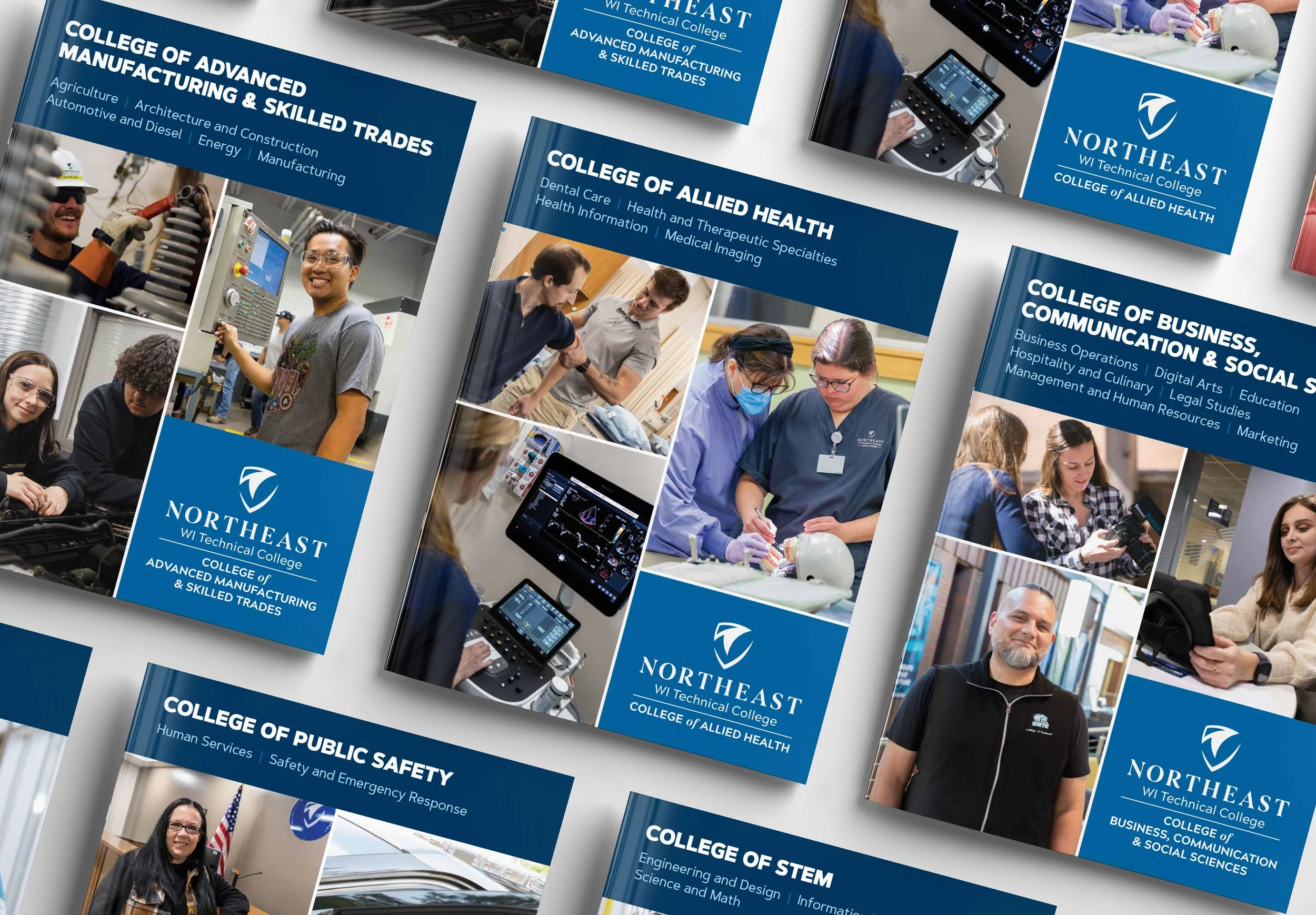
NWTC — Academic College Brochure Series
NWTC offers nearly 200 programs across a wide range of fields, and this series of six brochures was tasked with making all of that information feel organized, approachable, and visually compelling. Each brochure ranged from four to eight pages and covered a distinct academic college, weaving together program information, photography, and copy into a cohesive layout that stayed true to the NWTC brand. I handled everything from writing the copy to sourcing and placing photography, which meant managing a significant amount of content across the full series while keeping each piece feeling consistent and polished. It was equal parts editorial challenge and design project, and exactly the kind of complex, detail-heavy work I enjoy most.
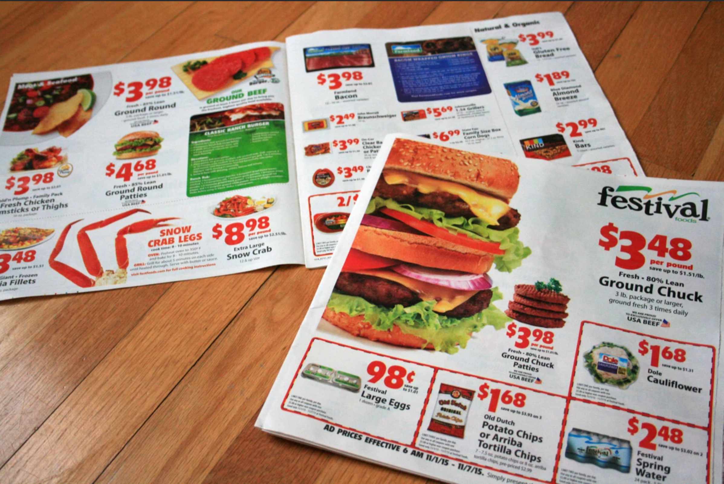
Festival Foods — Promotional Flyer Redesign
The Festival Foods weekly ad was due for a glow-up. What had been a dense, text-heavy newsprint circular was reimagined as a cleaner, image-driven insert that actually makes you want to pick it up. Larger appetite-appealing photography anchors each spread, while prices and product details are organized with more breathing room and clearer hierarchy. It's the kind of redesign that keeps all the essential information intact while completely changing how it feels to flip through, turning a habit into an experience.
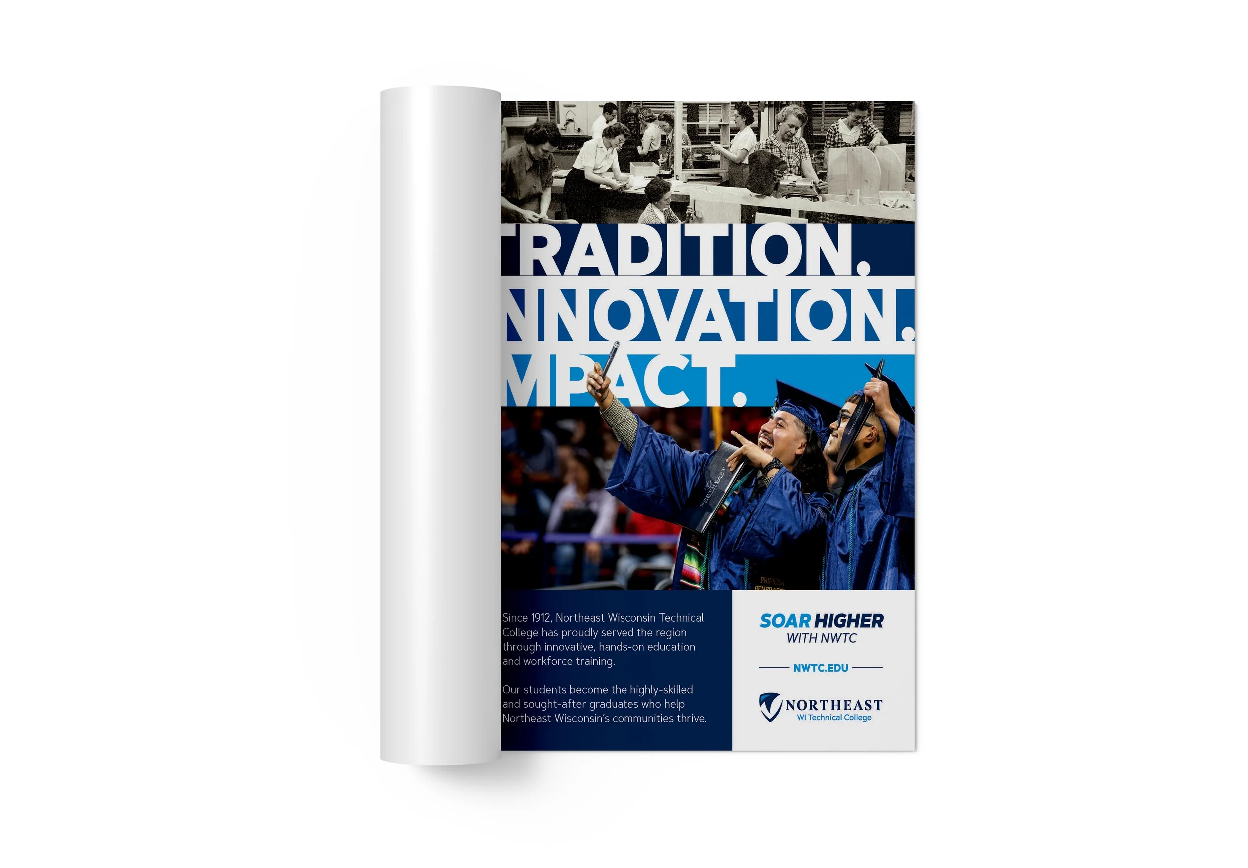
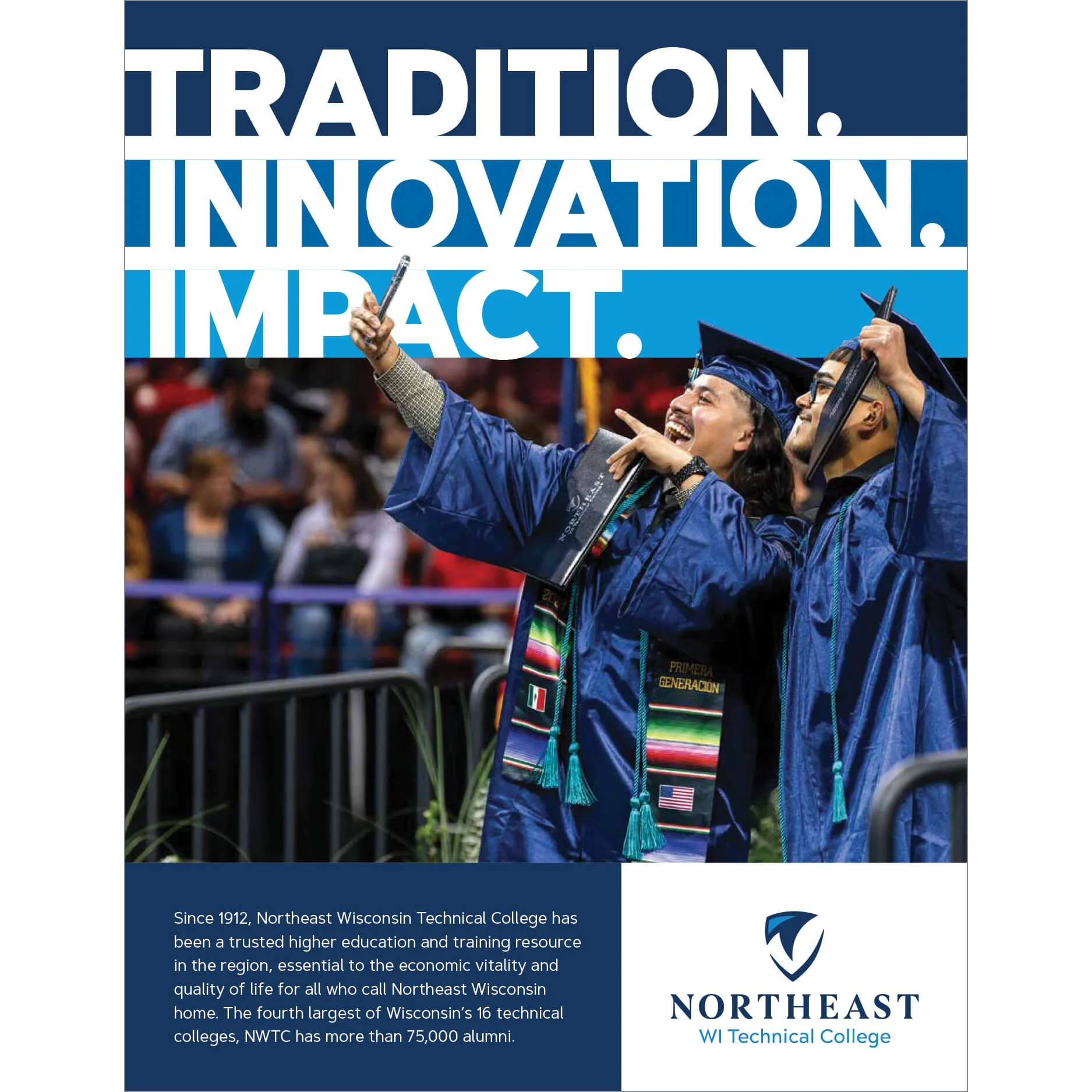
NWTC — Discover Green Bay Advertisement
This full-page ad for the Discover Green Bay publication had one job: remind the community who NWTC is and why it matters. The concept was built around three words, Tradition, Innovation, and Impact, that together tell the story of a college that has been shaping the region since 1912 and shows no signs of slowing down. The layout uses a split photography approach to make that story visual without saying a word. A vintage black and white archival photo anchors the top of the ad, nodding to the college's long history and deep roots in the community. Below it, a vibrant full-color graduation photo bursts with energy and pride, representing where NWTC is today and the students whose lives it continues to transform. The bold, oversized typography running across both images ties the two eras together, creating a visual bridge between past and present. It's a piece that leads with emotion first and information second, exactly the way a good community-facing ad should.
NWTC College Profile Booklet
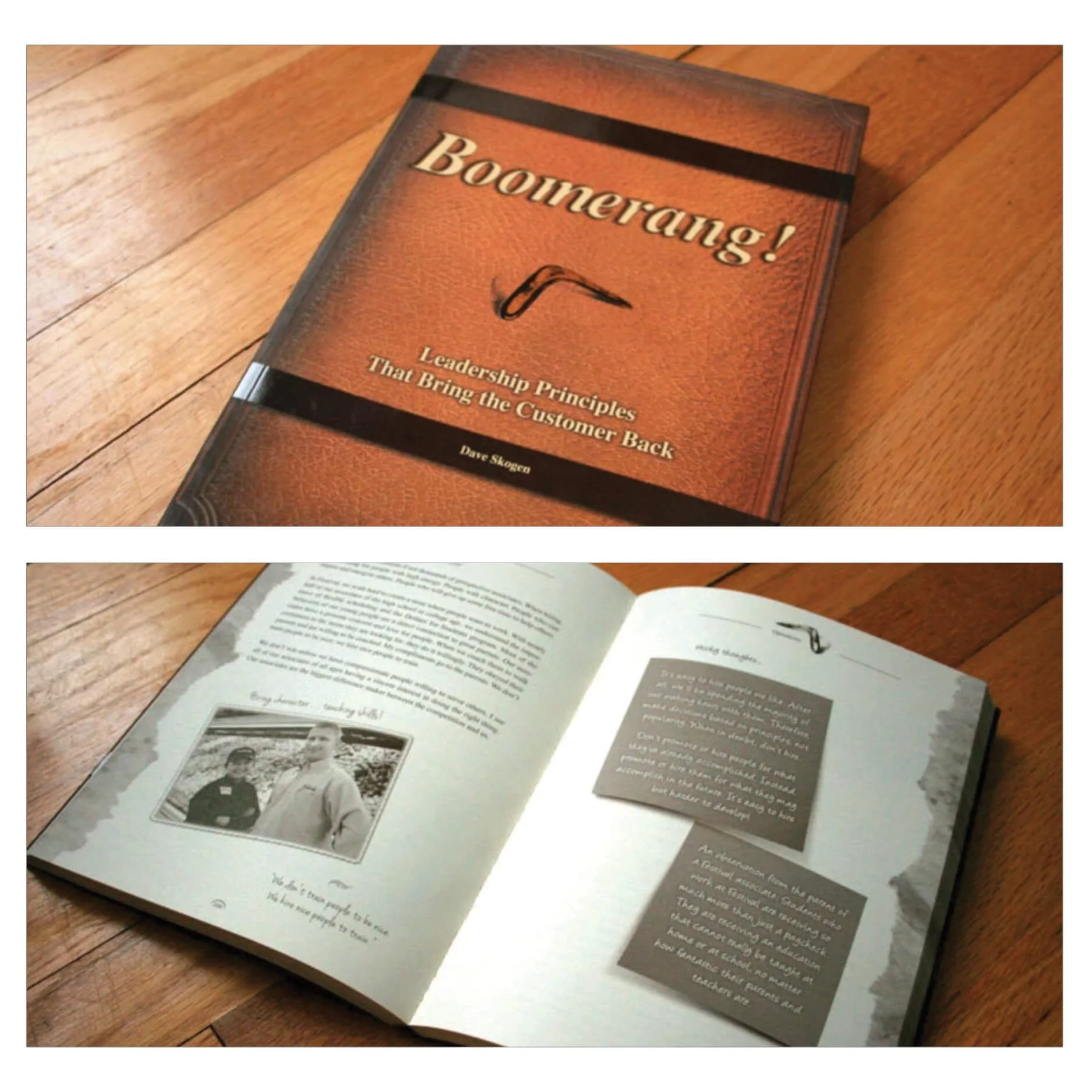
Boonerang! Book
Artisan and Business Center Class Catalogue
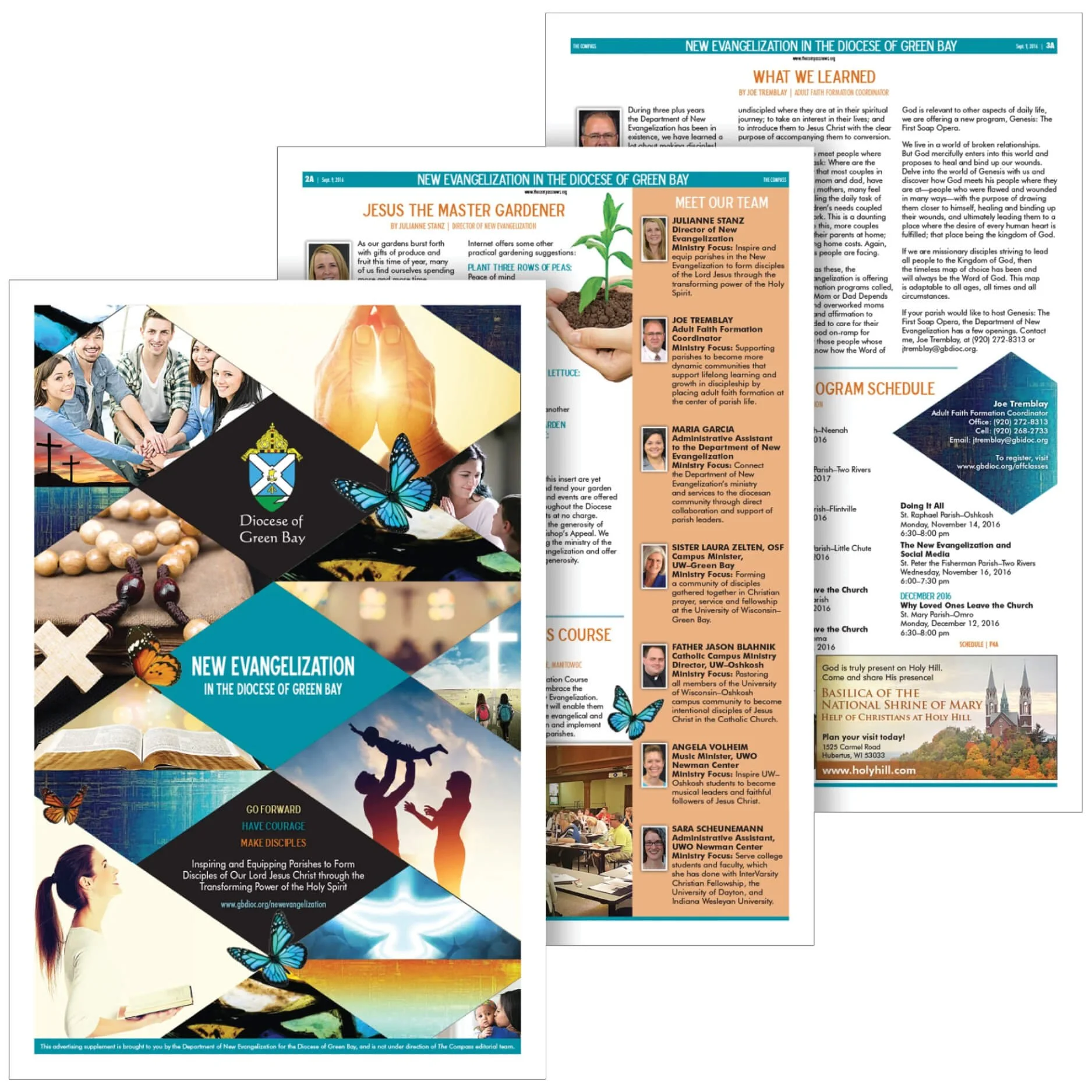
Diocese NEW Evangelization Insert
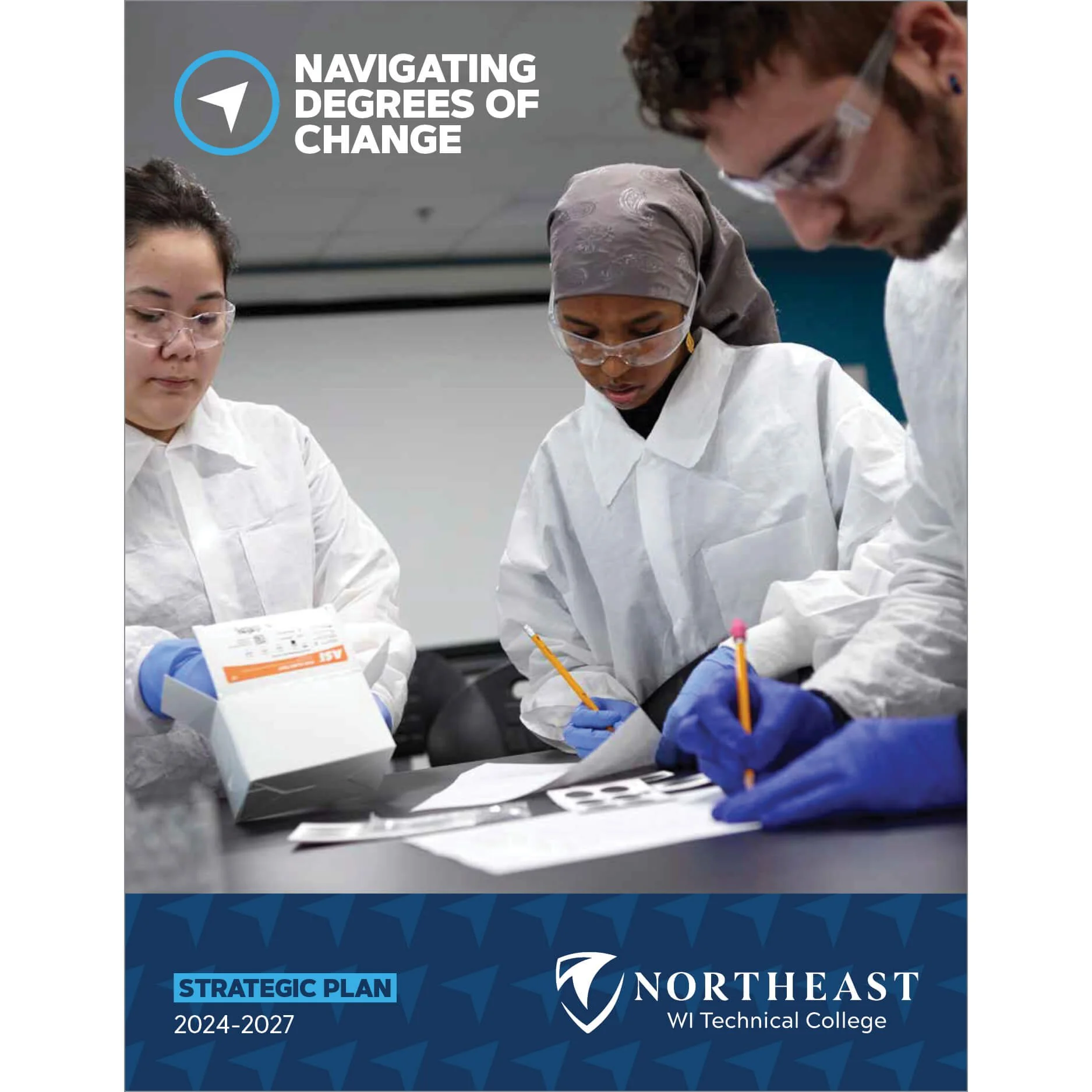
NWTC Strategic Plan
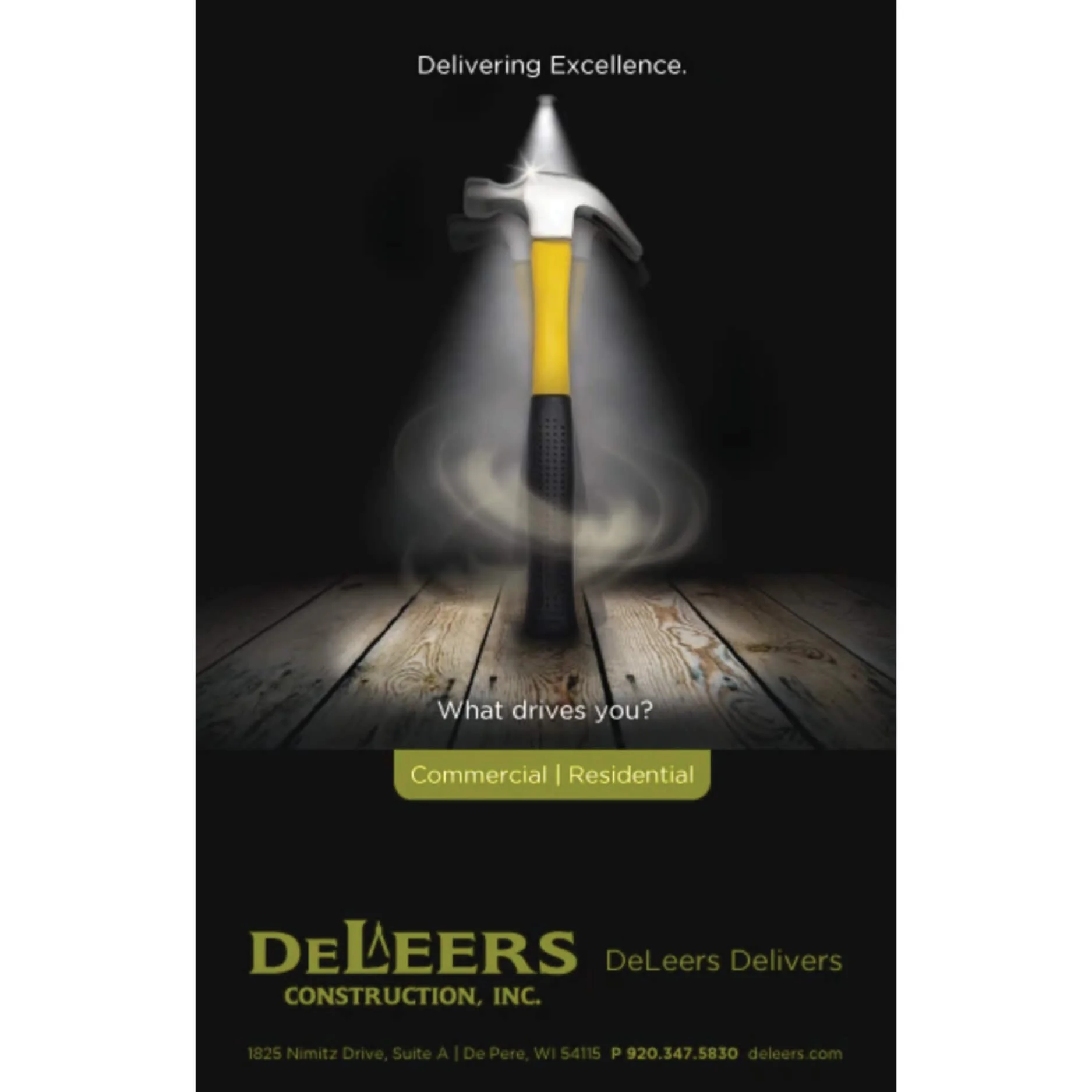
DeLeers Delivering Excellence Ad
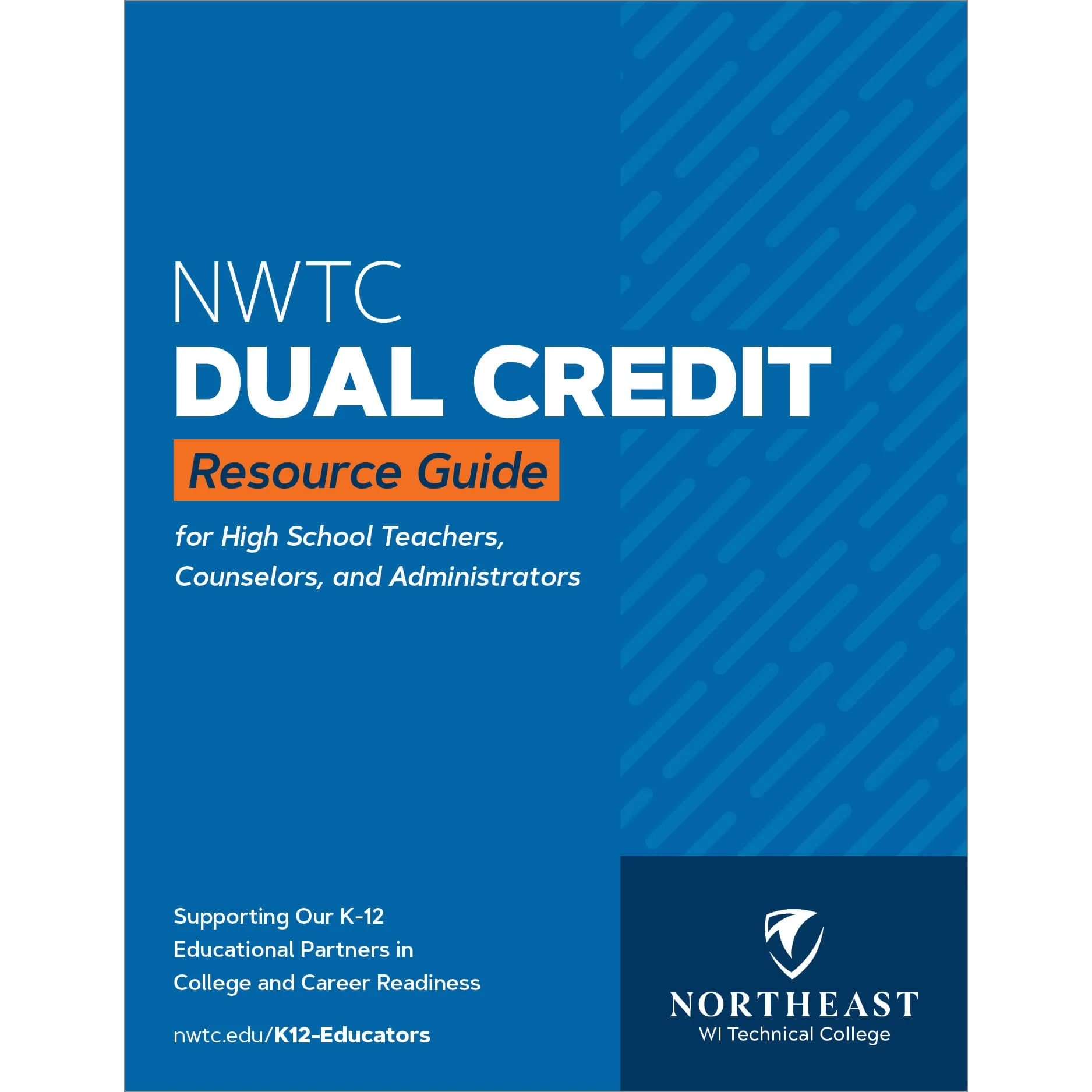
NWTC Dual Credit Resource Guide
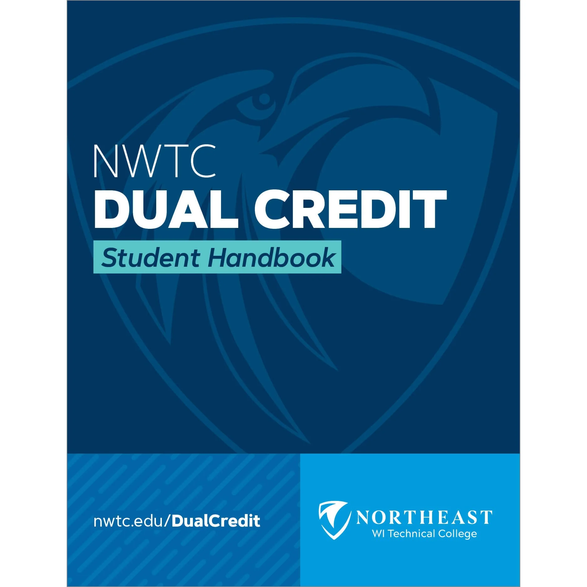
NWTC Dual Credit Student Handbook
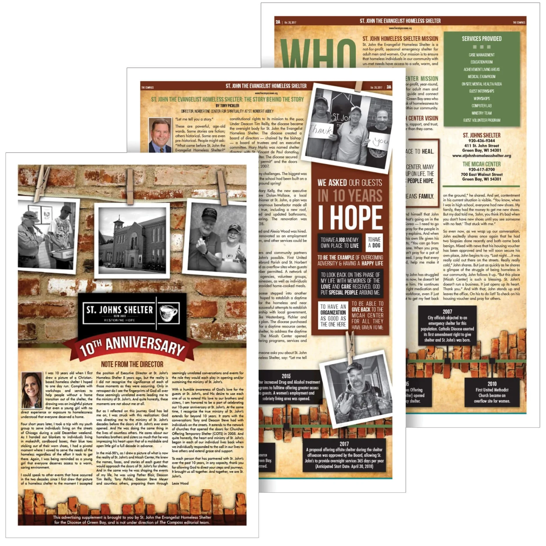
Diocese St. John's Shelter 10th Anniversary Insert
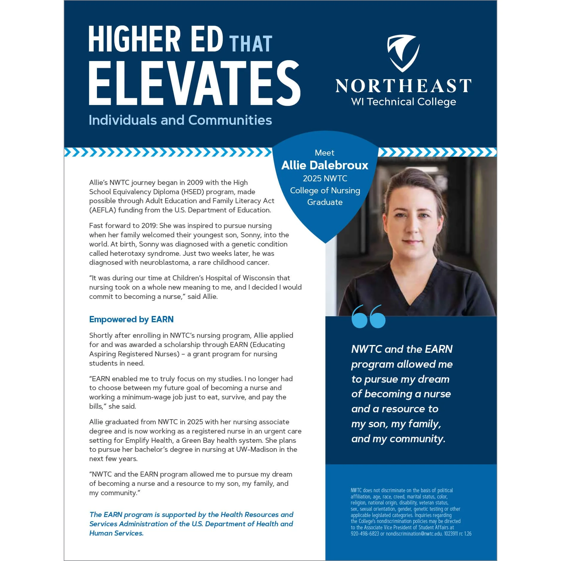
NWTC Higher Ed Elevates Ad
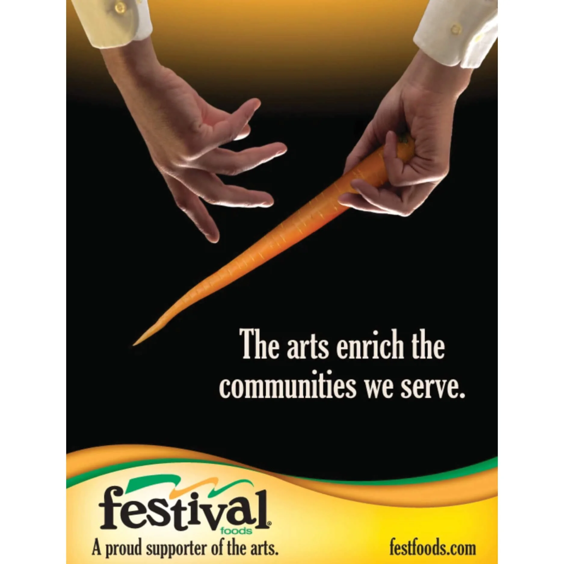
Festival Foods The Arts Enrich Ad
NWTC Tradition Innovation Impact Brochure