Environmental
Graphic Design
Environmental graphics are where design gets physical. These projects go beyond the screen and the printed page, transforming hallways, rooms, and walls into experiences that inspire, inform, and set the tone for everything that happens inside them. Every project in this section started with a blank wall and a conversation about what a space should make people feel.
Featured Projects
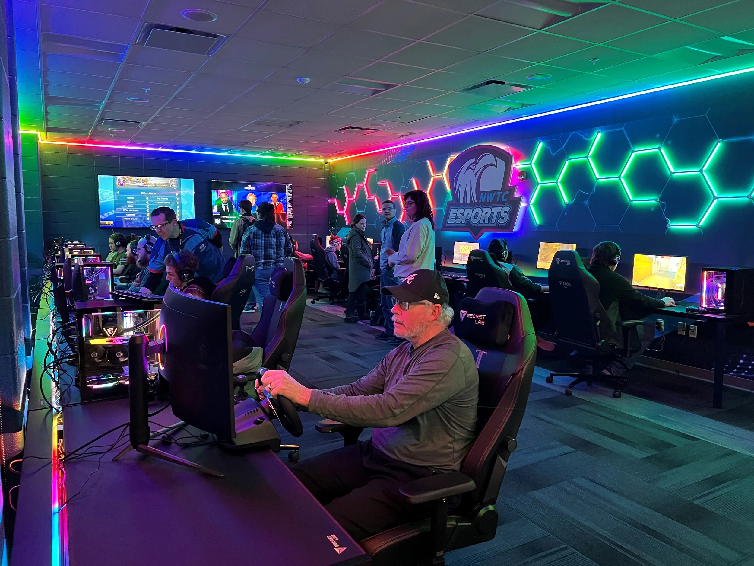
NWTC – Eagle ESPORTS Zone
When NWTC set out to create a dedicated esports space, the design needed to do more than look cool. It needed to feel like it belonged to the students. I developed three distinct vision concepts for the room, each with its own identity, color story, tagline, and mascot logo variation, before Vision 3 was selected. The chosen direction was built around the values of connection, inclusivity, and community. Deep blues, purples, and pinks were intentional nods to both the gaming world and NWTC's existing iRespect! diversity and inclusion branding, signaling that this space was for everyone. A repeating hex map pattern, commonly used in game design, added a meaningful layer of authenticity, while the tagline "Changing the Game" reflected NWTC's forward-thinking approach to both technology and inclusion. The mascot logo was reimagined to give it its own identity within the space. The final design extended across wall graphics, window vinyl, desk wraps, glass etching, laser cutting, and screensavers, creating a fully immersive environment from floor to ceiling.
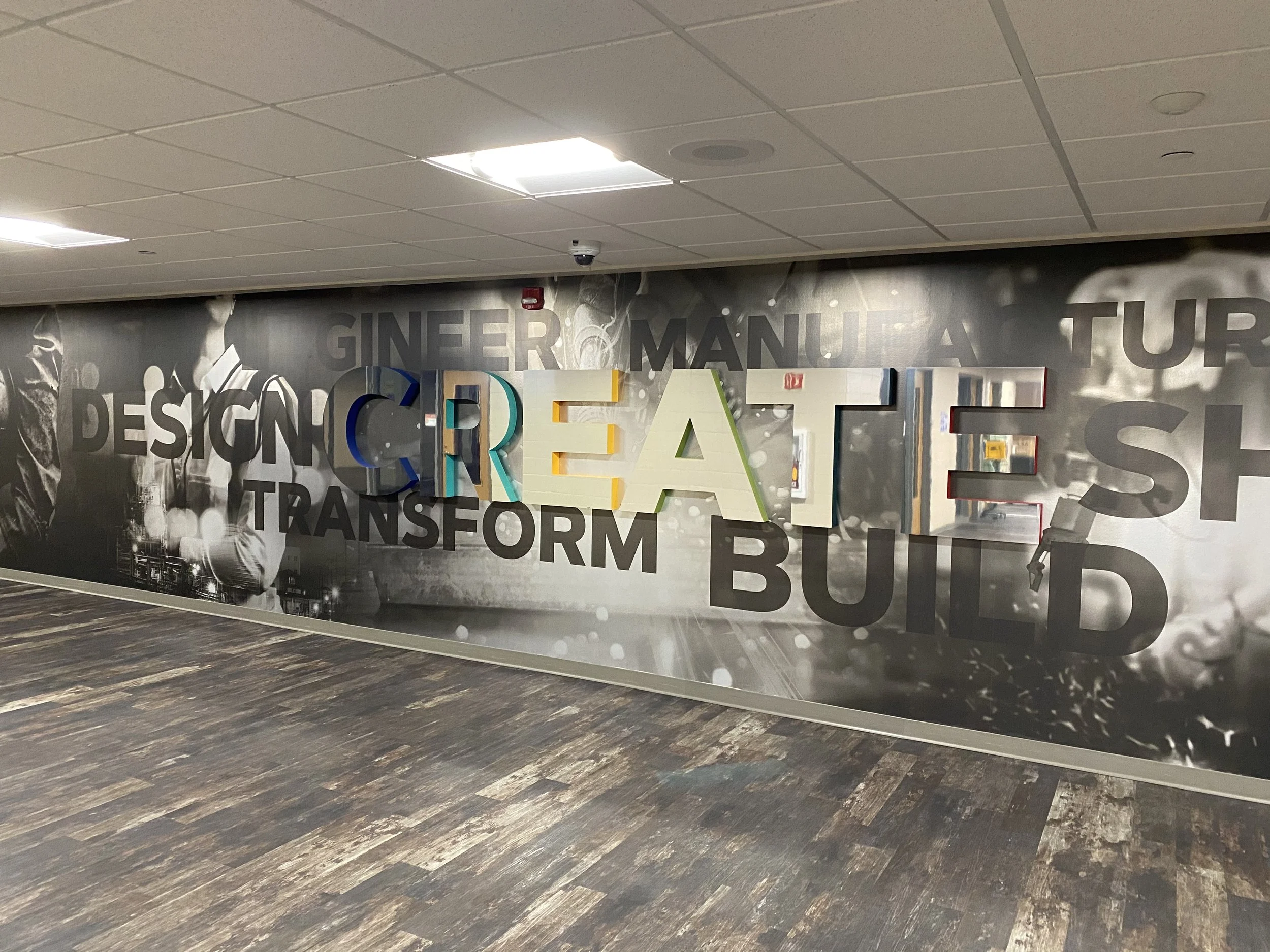
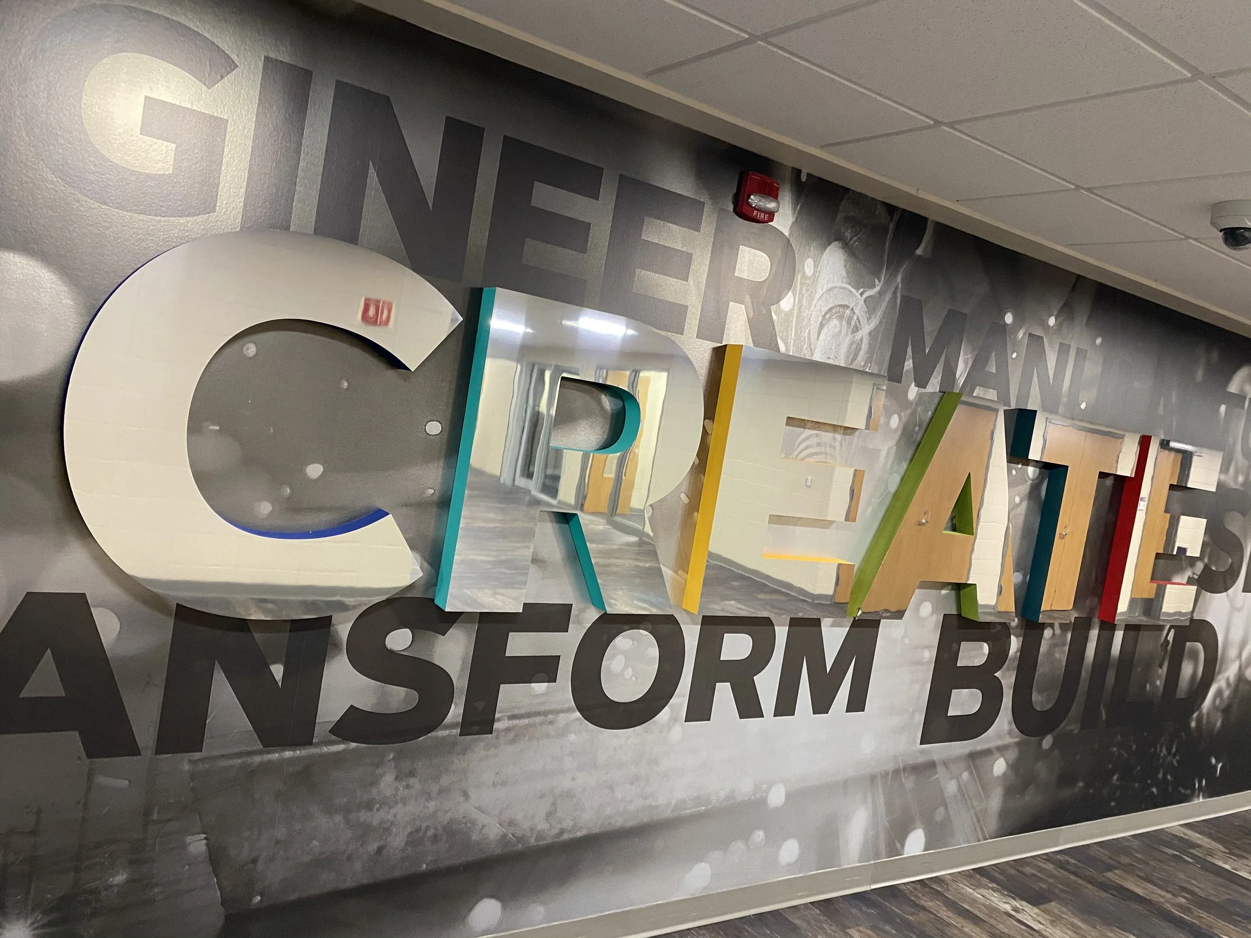
NWTC – CREATE Wall
The Trades and Engineering Technology hallway needed a wall that could stop a student in their tracks and make them feel something. Starting with three distinct concept directions, ranging from mirrored typographic lettering to grand motivating imagery, the final design was a combination of concepts one and three, blending powerful monochromatic photography of tradespeople at work with bold 3-D lettering that literally jumps off the wall. Words like Engineer, Build, Design, Transform, and Shape were chosen intentionally to speak directly to the students walking that hallway every day, reminding them of the real-world impact of the skills they're building. The 3-D letters feature mirrored fronts with bright color pops on the sides, adding dimension and energy, while the background carries a metallic finish that ties into the wallpaper used throughout the same hallway. The imagery wraps around corners to create a seamless, immersive experience rather than a flat graphic on a single surface. It's the kind of environmental design that doesn't just decorate a space, it defines it.
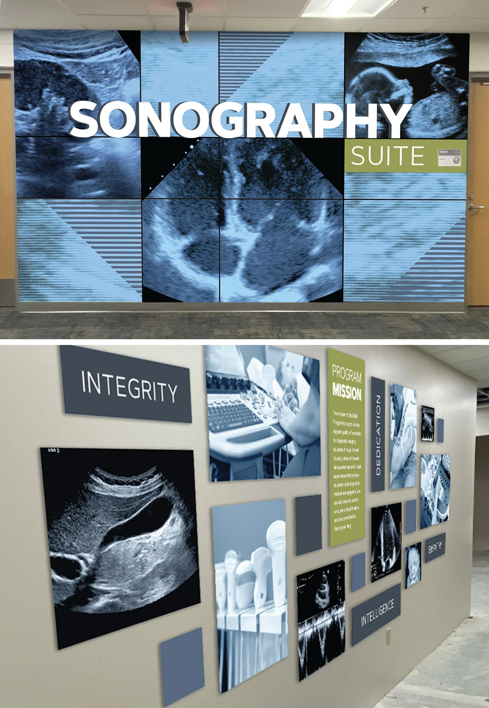
NWTC – Sonography Suite
The Sonography Suite needed environmental graphics that felt as precise and purposeful as the program itself. The design spans two distinct spaces, a main hallway wall and a lab entrance wall, each with its own function but tied together by a cohesive visual language. For the main wall, a large-scale close-up of an ultrasound image forms the background, immediately grounding visitors in the world of diagnostic imaging. A light blue color palette adds brightness to the hallway while the grid-like pattern and muted tones were carefully coordinated with the surrounding interior design elements, including the fabrics and flooring already present in the Health Science lower level. The word SONOGRAPHY was produced as 3-dimensional lettering with painted sides, allowing it to pop off the wall and create a focal point that commands attention from down the hall.
The lab entrance wall takes a different but complementary approach. A layered system of acrylic standoffs at varying depths displays a mix of imagery, inspirational word panels, colorful block elements, and a prominently featured program mission statement printed in bright green for emphasis and easy replaceability as new cohorts move through the program. The organic block pattern intentionally mirrors elements from the main wall, creating a seamless and intentional experience as students and visitors move from one space to the next. Every detail, from material choice to color to depth, was considered with both function and feeling in mind.
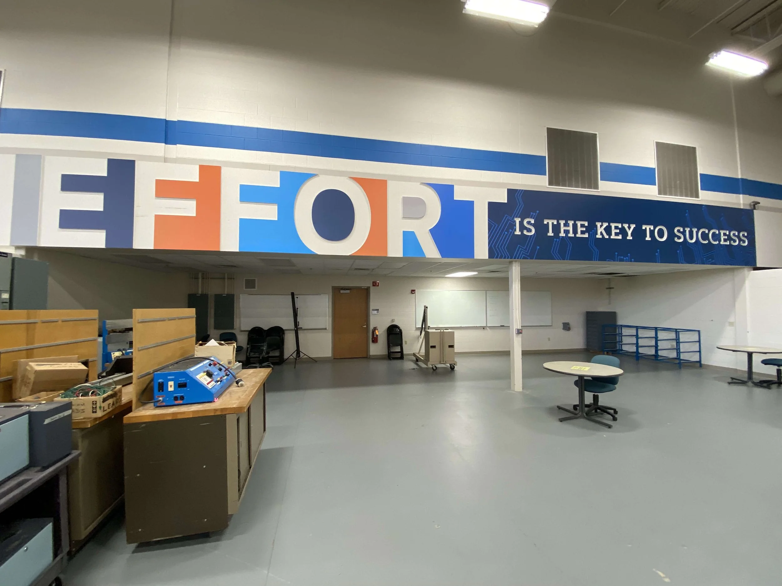
NWTC Engineering Technology Center
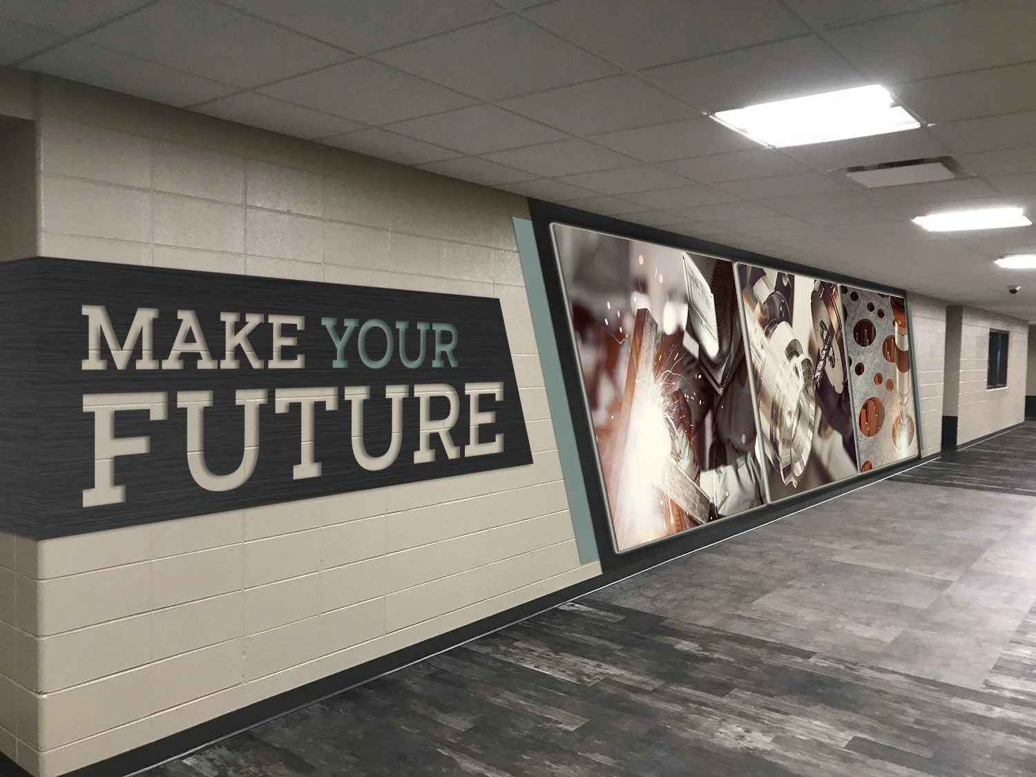
NWTC Manufacturing Hallway
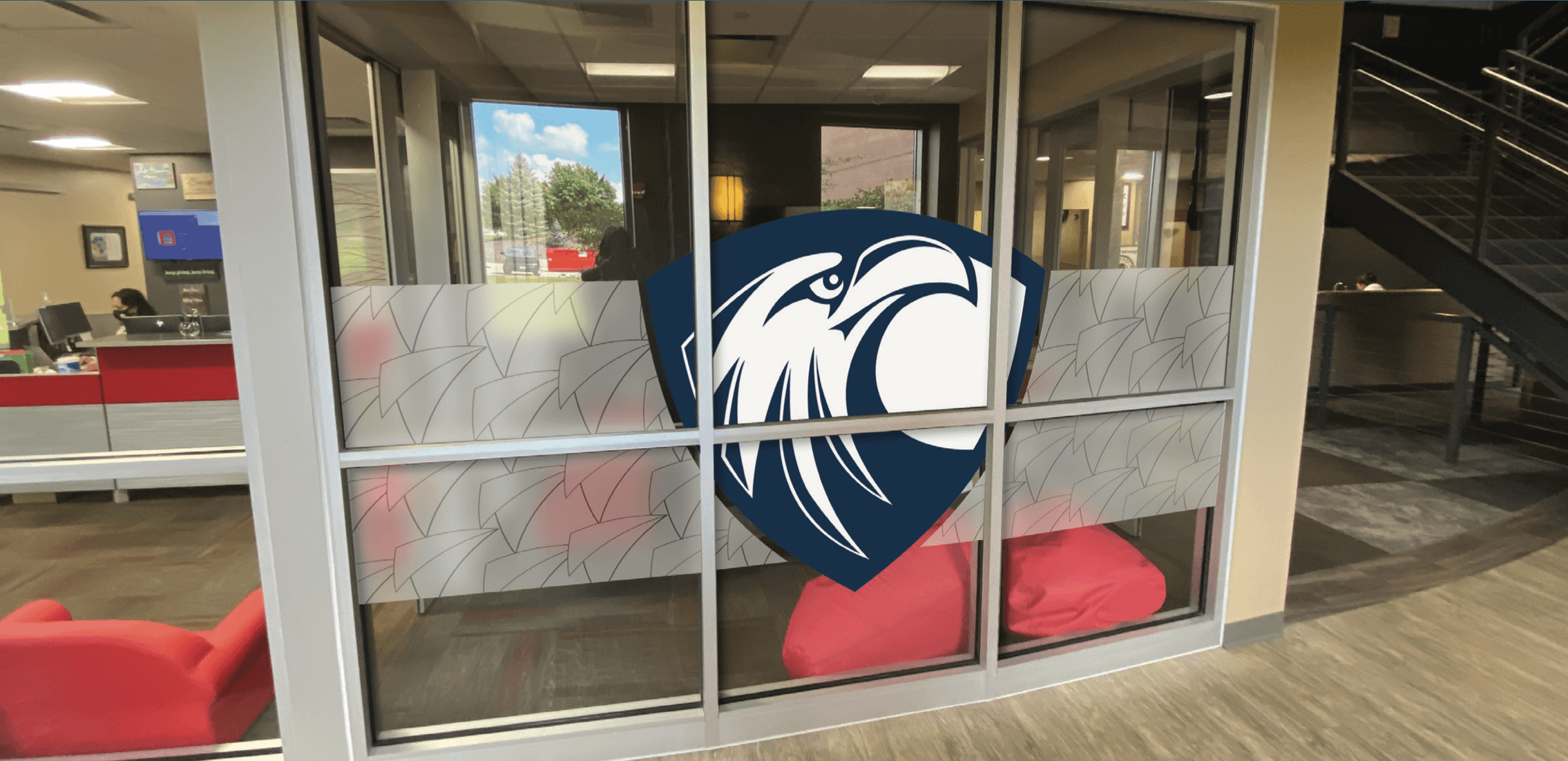
NWTC Collaboration Room Privacy Vinyl
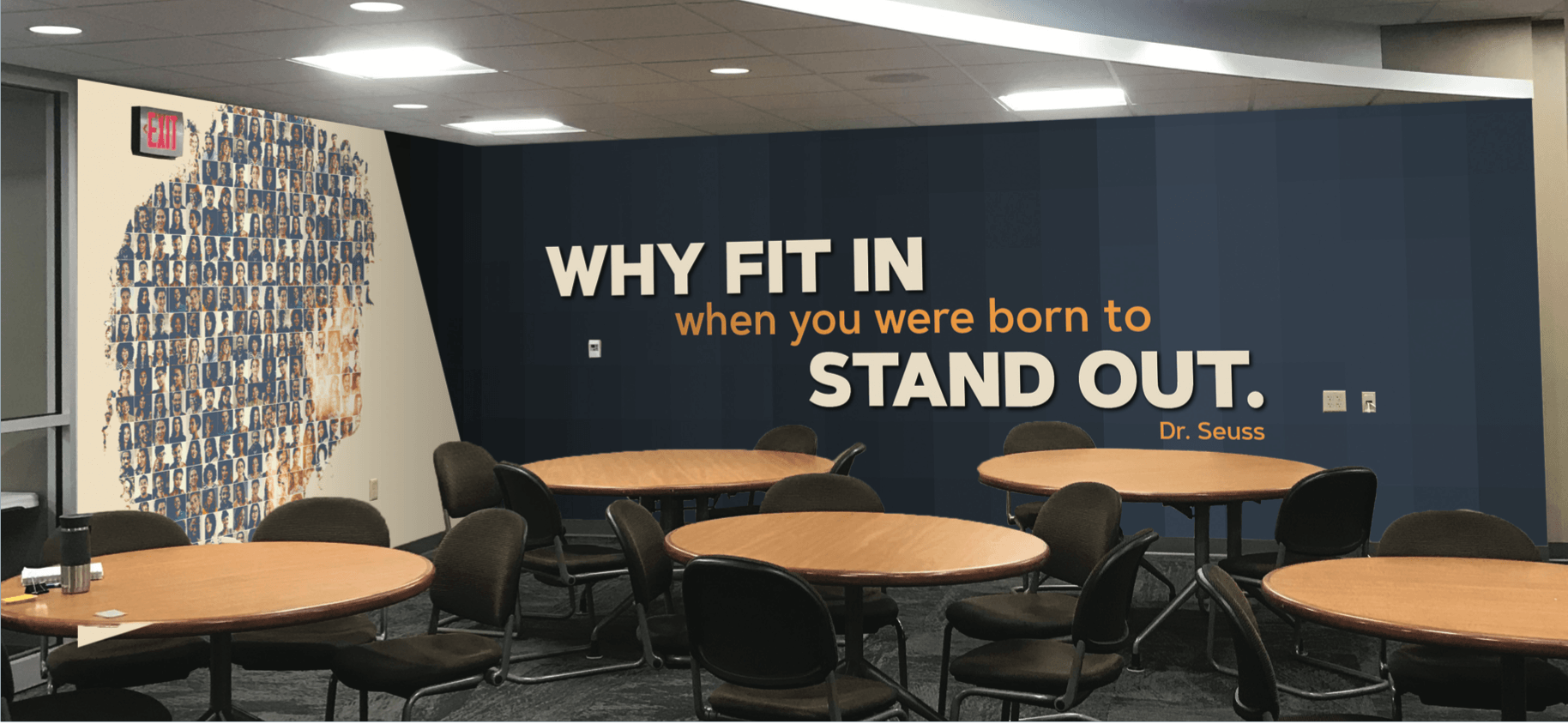
NWTC People Pocket
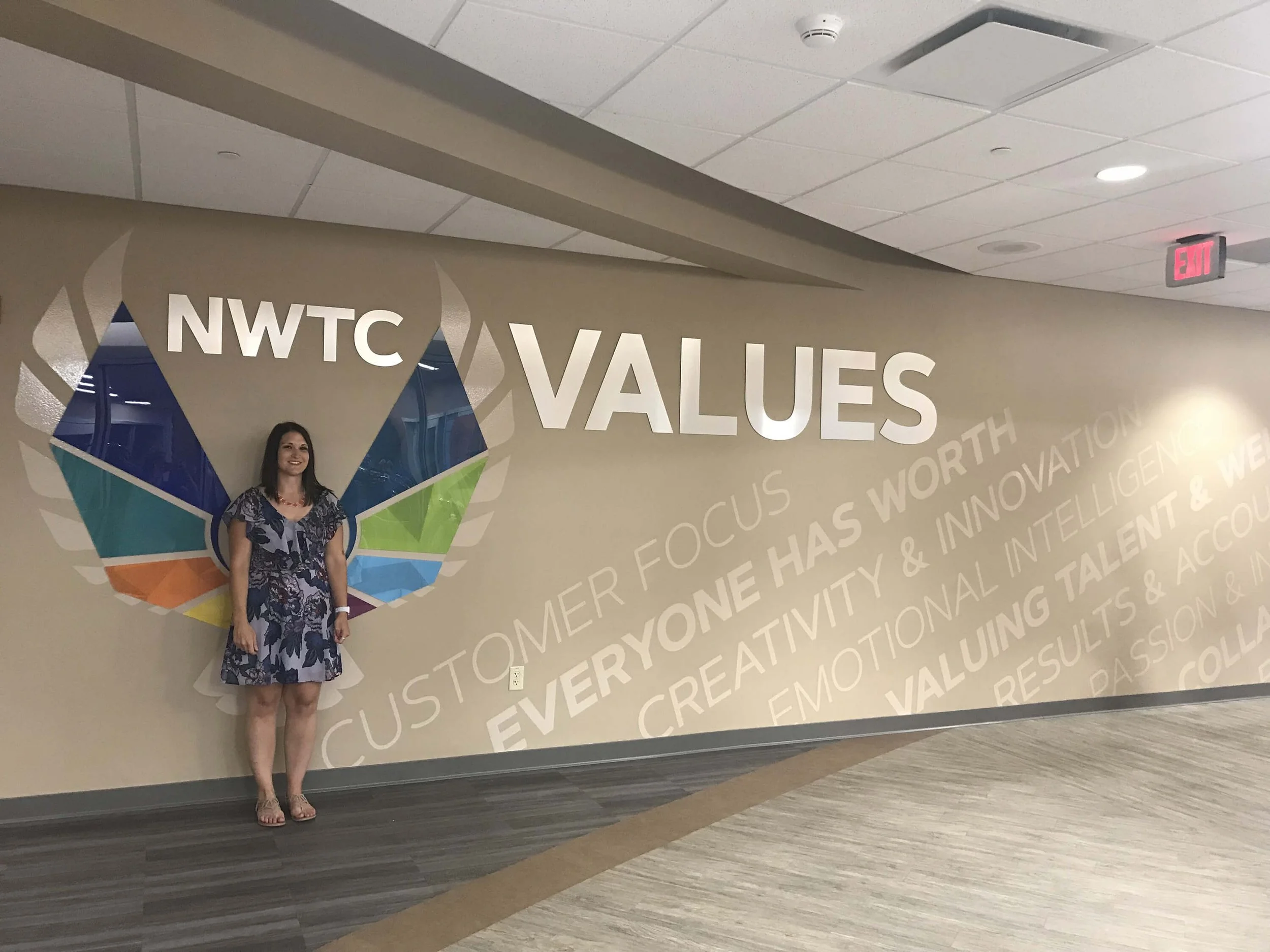
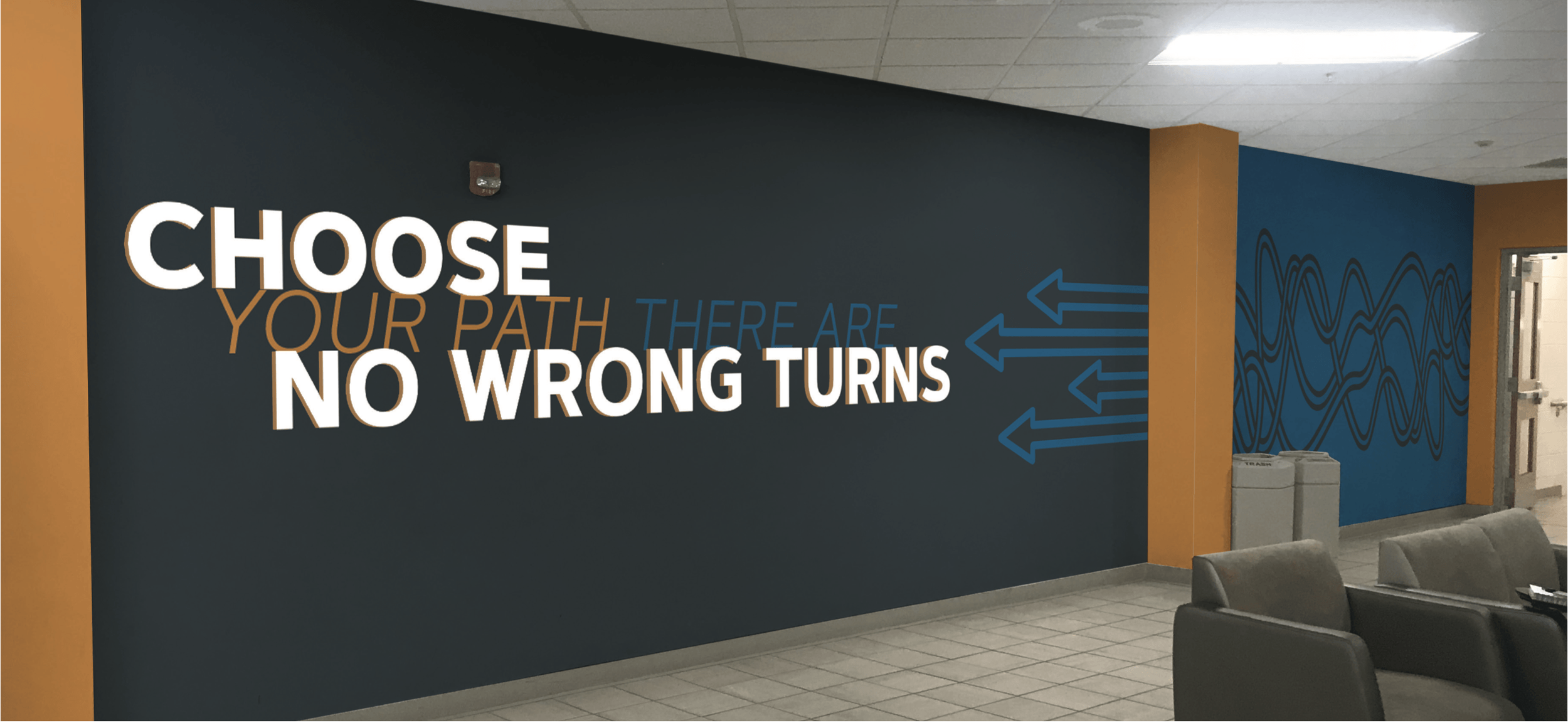
NWTC Values Wall
NWTC Eagle Event Center