Signage & Tradeshow
There's a unique challenge in designing for large format. What looks great on a screen has to survive being blown up to six feet tall, viewed from across a room, and competing with everything else happening around it. This section features signage and tradeshow work where the design had to be bold enough to stop people in their tracks, clear enough to communicate in seconds, and polished enough to represent a brand at its best.
Featured Projects
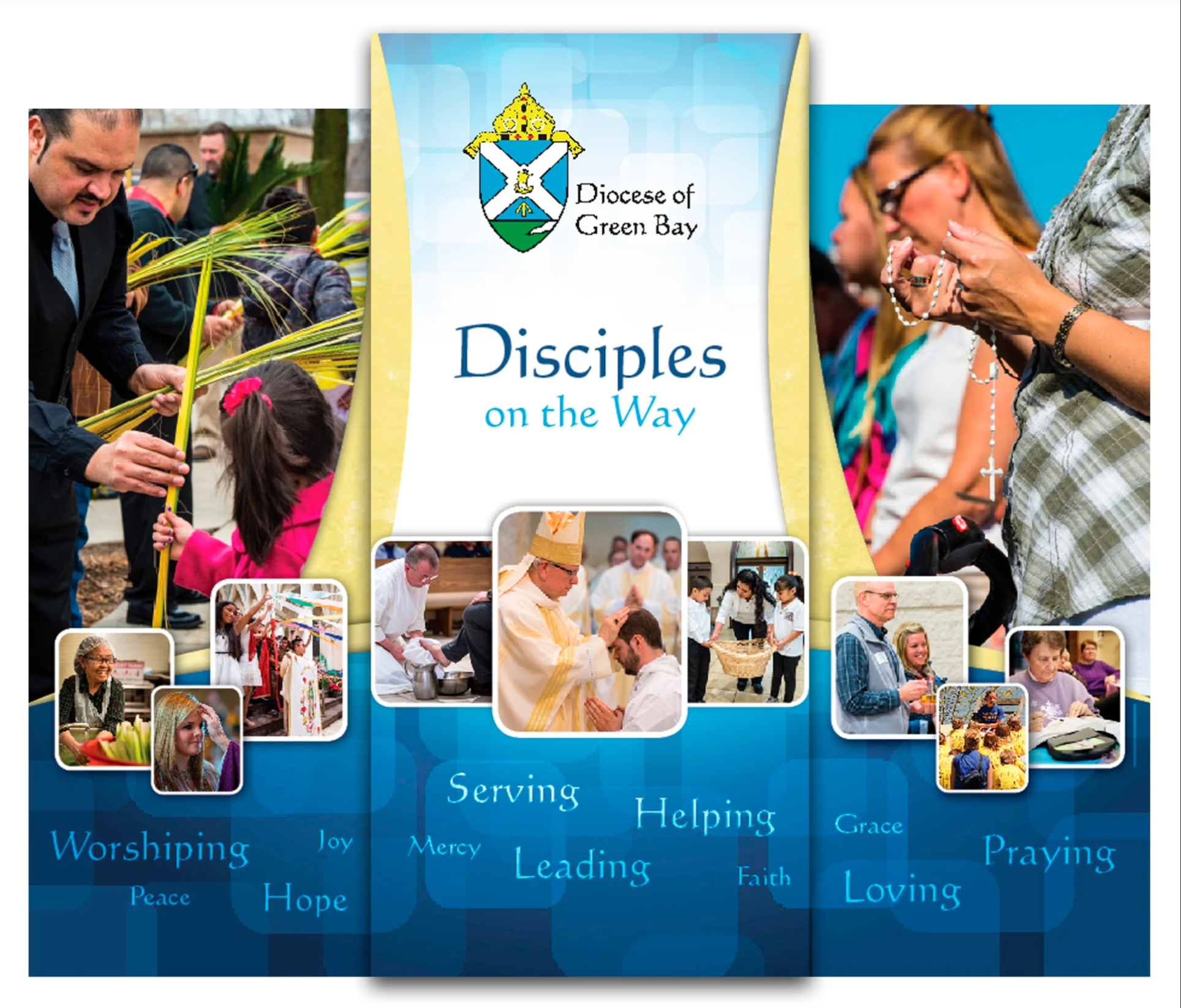
Diocese of Green Bay — Tradeshow Display
This three-panel retractable banner display for the Diocese of Green Bay was designed to represent the heart of the organization at events and gatherings. The campaign theme, Disciples on the Way, anchors the center panel and sets the tone for the entire display. The design balances warmth and reverence, using the Diocese's existing blue and gold color palette alongside rich, candid photography that captures real moments of worship, service, community, and faith. Rather than relying on formal or institutional imagery, the photos feel genuine and human, showing the Diocese as an active, living community of people. Inspirational words like Worshipping, Serving, Praying, Loving, and Hope are woven throughout the panels at varying sizes, creating visual movement and reinforcing the values of the organization without overpowering the imagery. The result is a display that feels welcoming and approachable, exactly the kind of presence you want representing a faith community at a public event.
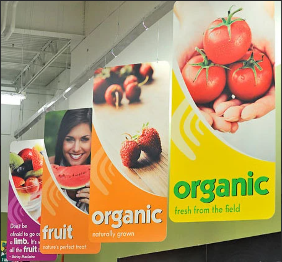
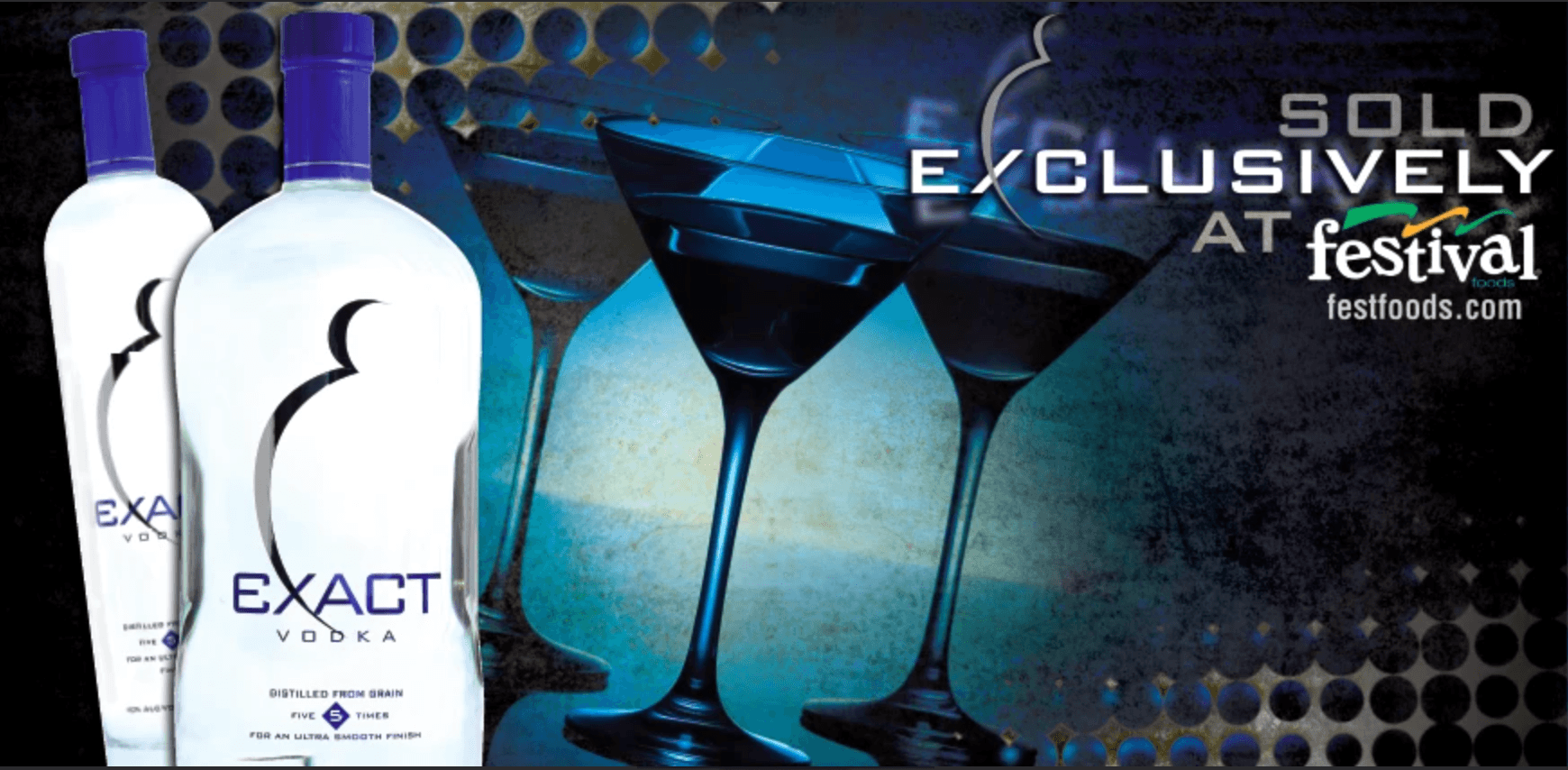
Festival Foods — In-Store Hanging Signage
These hanging signs were part of a larger in-store environmental design project for Festival Foods, bringing color, energy, and personality to the shopping experience. Each sign was designed around a specific department or product category, using bold, vibrant color blocking, appetizing photography, and short taglines to draw the eye and add warmth to the store environment. The goal wasn't just wayfinding, it was creating a shopping atmosphere that felt fresh, friendly, and inviting. I handled everything from concept and copy to photo sourcing, making sure each sign felt cohesive as part of the larger system while still having its own visual identity. The result is the kind of design that shoppers might not consciously notice, but would definitely feel the absence of, which is often the highest compliment in environmental and retail design.
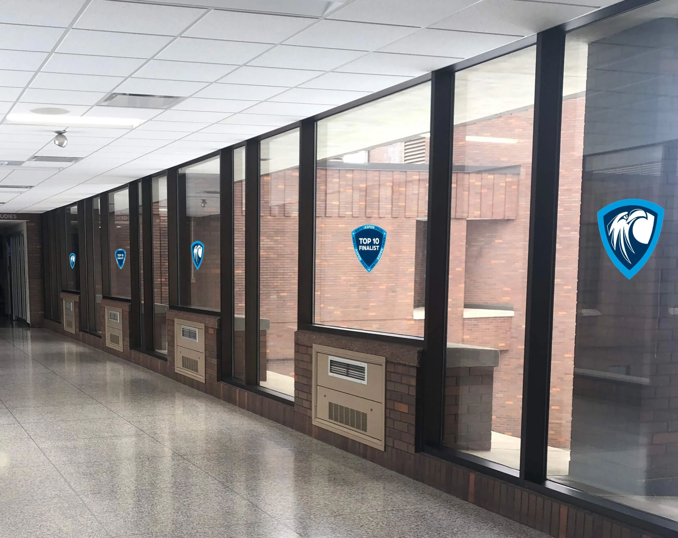
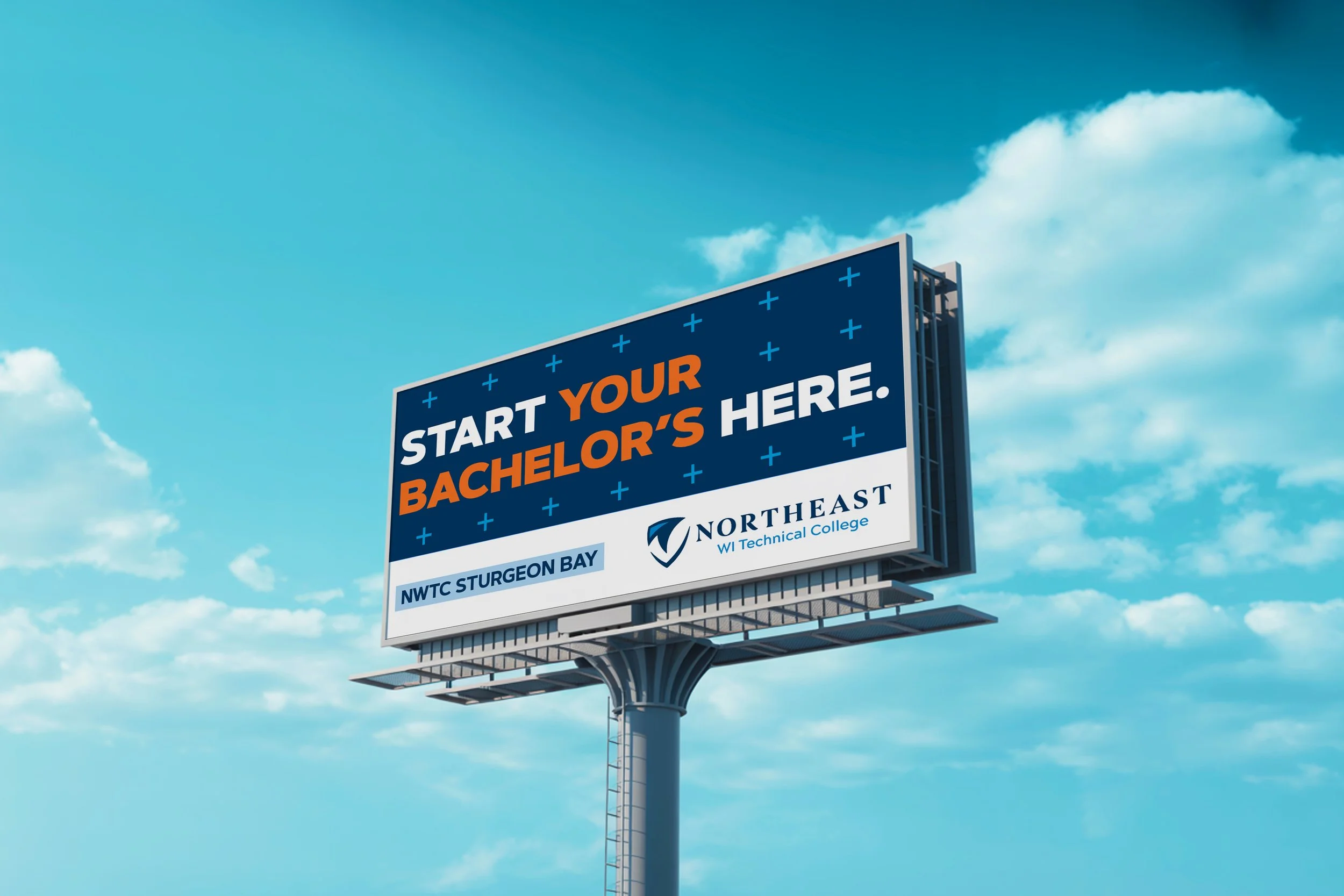
NWTC — Associate of Arts & Science Billboard Campaign
Sometimes the most effective design is the most direct. This billboard campaign for NWTC was built around a simple but powerful idea: students in the Marinette and Sturgeon Bay areas don't have to go far or spend a fortune to start working toward a bachelor's degree. The campaign ran across multiple billboard locations in both markets, with four distinct poster variations that each approached the message from a slightly different angle, from value-focused headlines like "Save Thousands on Your Bachelor's" to confidence-building lines like "Starting Your Bachelor's at NWTC? Smart." The design stays clean and bold throughout, leaning on the NWTC brand colors of Eagle Blue and Orange You Proud with strong typography that reads instantly from the road. The subtle plus sign pattern adds visual texture without competing with the message, and the campus callout at the bottom of each board keeps the communication local and relevant. It's a campaign that does exactly what a good billboard should: one clear idea, communicated in about three seconds.